( Banking ) 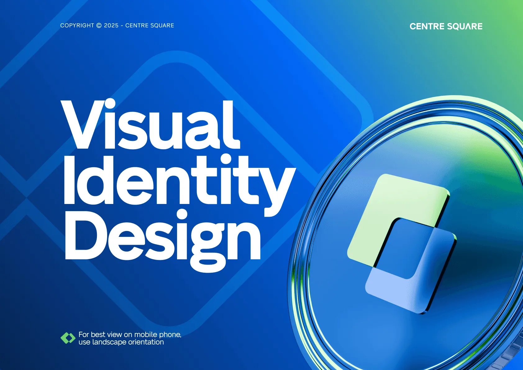
Centre Square
A bank brand built to feel steady in a growth year.
Built on trust, made for growth

Brand board
A bank that feels steady
logo, colour, type and icon system

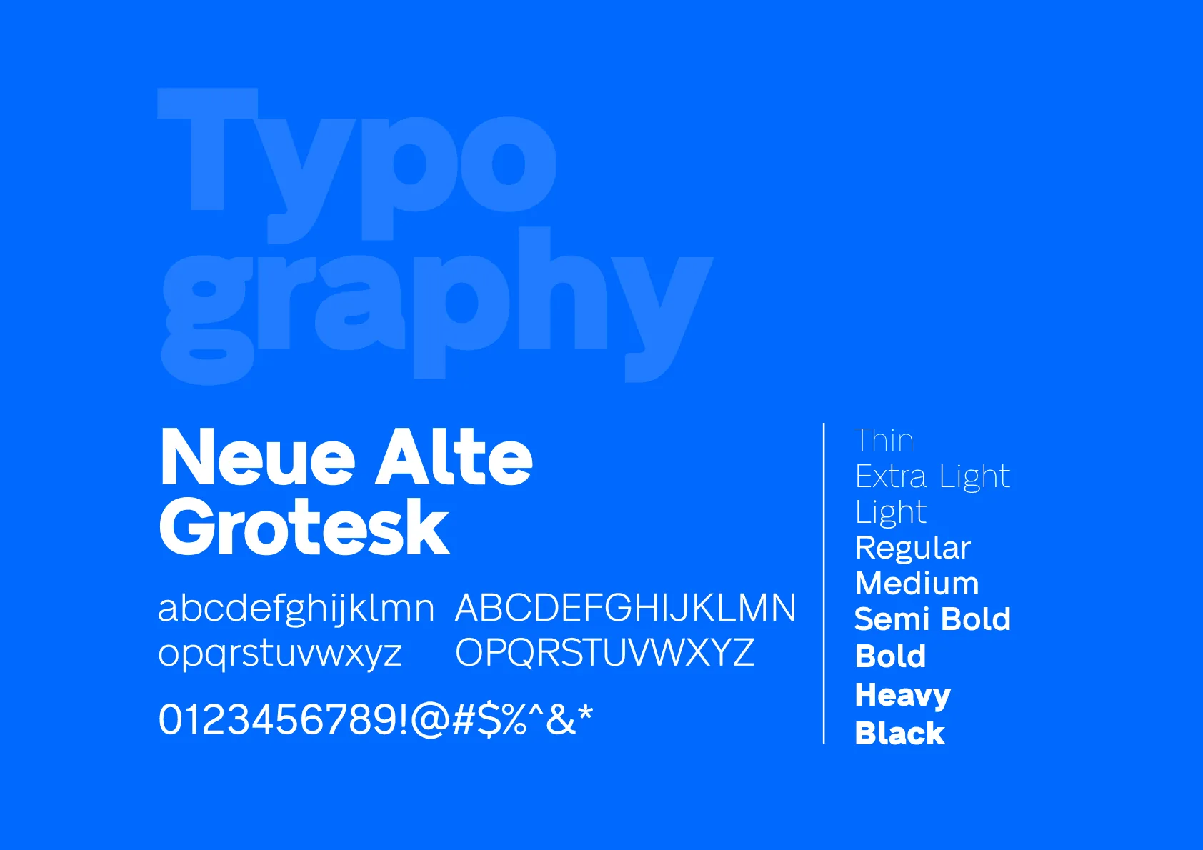
Aa Typeface: Neue Alte Grotesk


About
Centre Square needed a brand identity that communicates stability, trust and forward-thinking leadership. As a bank in a regulated, credibility-driven industry, its identity had to inspire confidence while staying modern and competitive during a growth and funding phase.
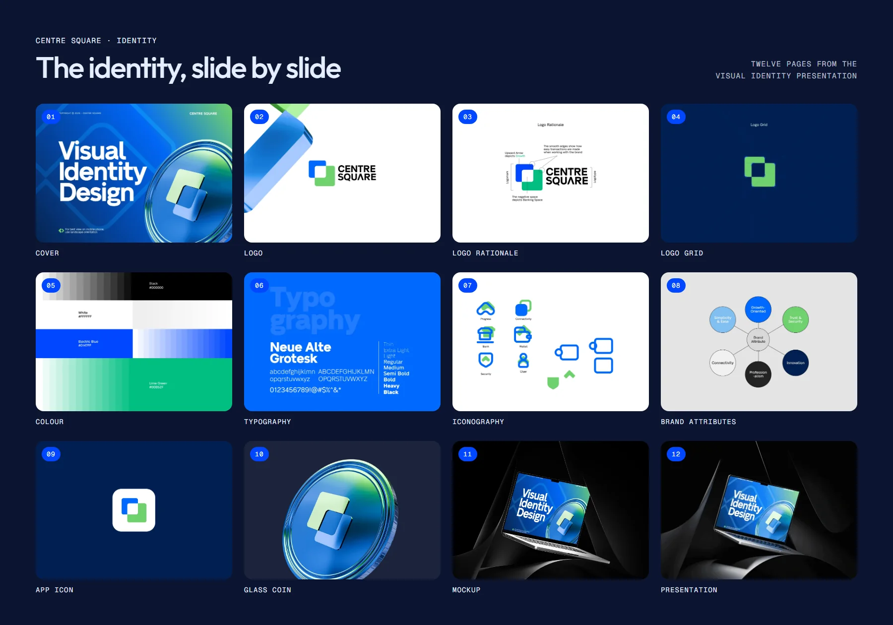
- Logo and rationale
- Logo grid
- Colour palette
- Typography
- Iconography
- Brand attributes
Project Line
Week-1
Week-2
Week-3
The challenge
What needed solving
Rebranding a financial institution during growth means changing how it looks without making customers feel anything about their money has changed.
What we did
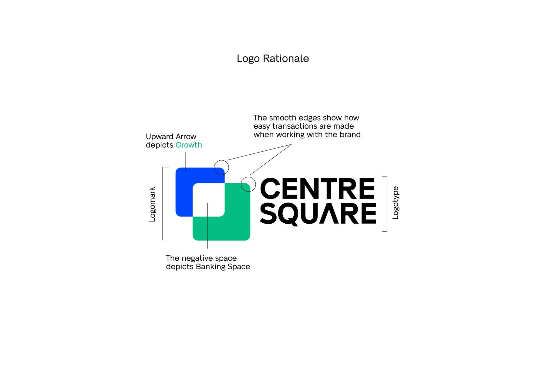
- Designed a mark of two overlapping squares: the upward offset reads as growth, the negative space as the banking space between them.
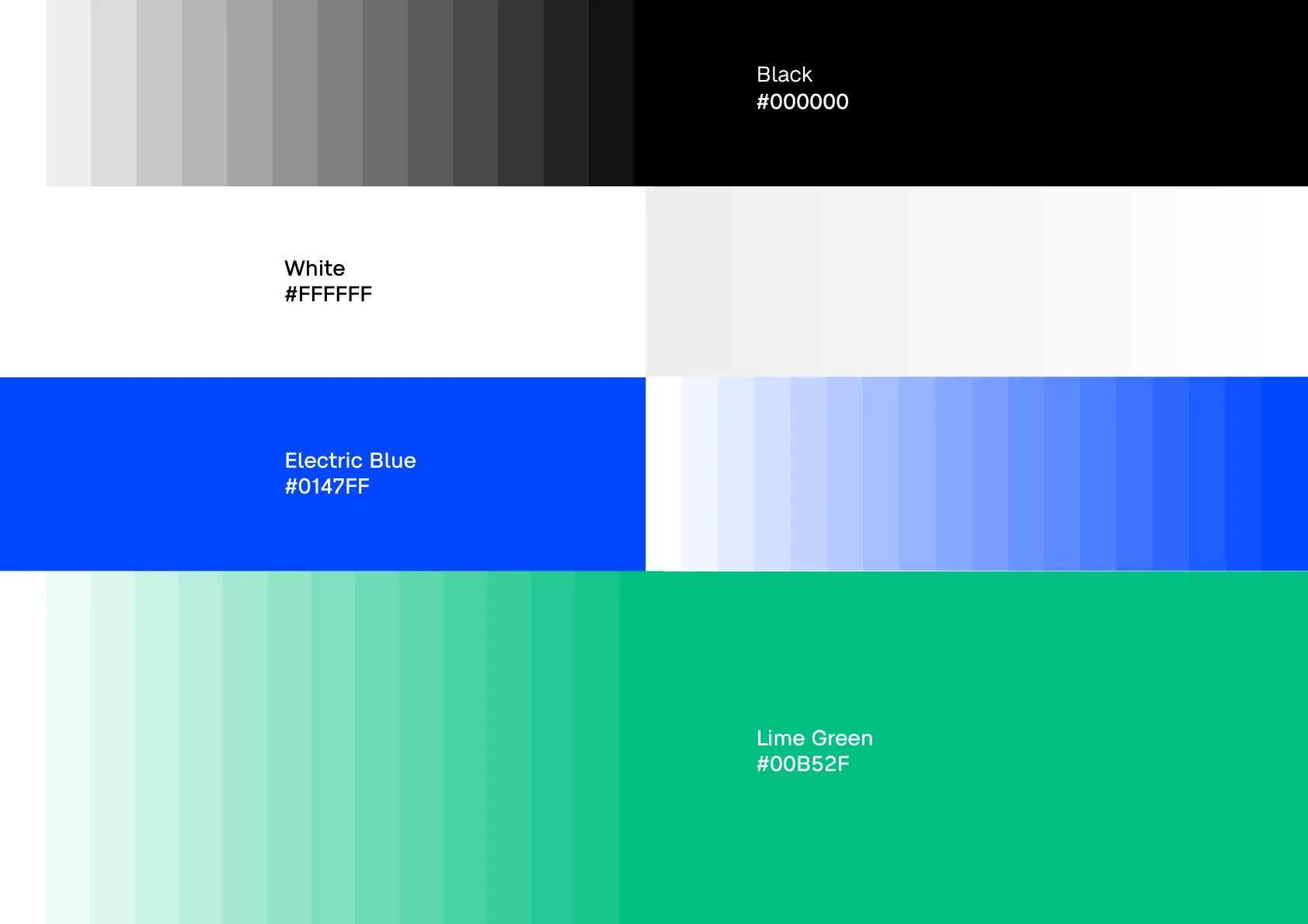
- Set Electric Blue and lime green against deep navy for a confident, accessible palette.
- Chose Neue Alte Grotesk for clear, neutral type from thin to black.
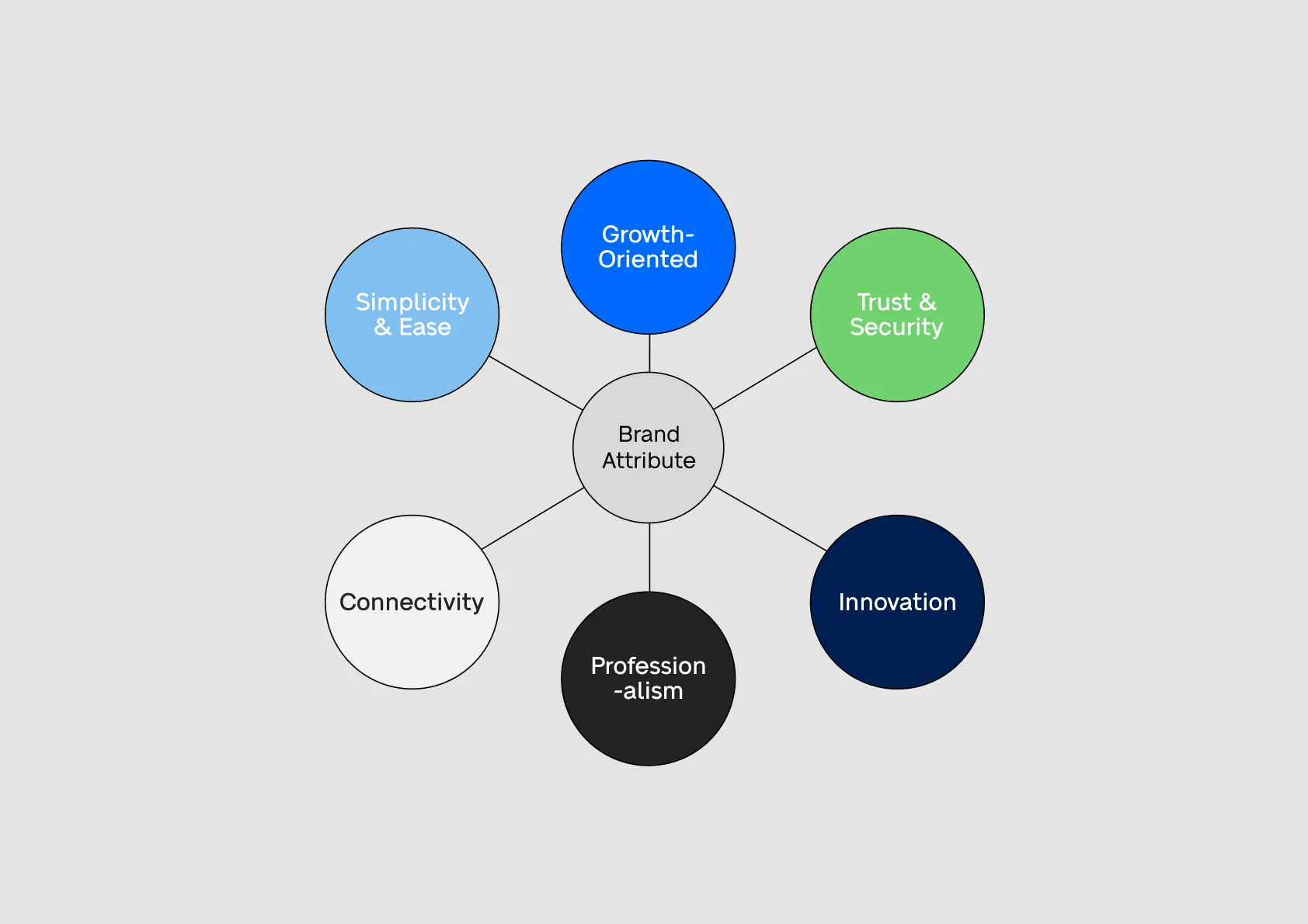
- Mapped the brand attributes (growth, trust and security, innovation, professionalism, connectivity, simplicity) into an icon set.
Delivered
- Logo and rationale
- Logo grid
- Colour palette
- Typography
- Iconography
- Brand attributes
Thanks for looking. Want one like this?