( Choir ) 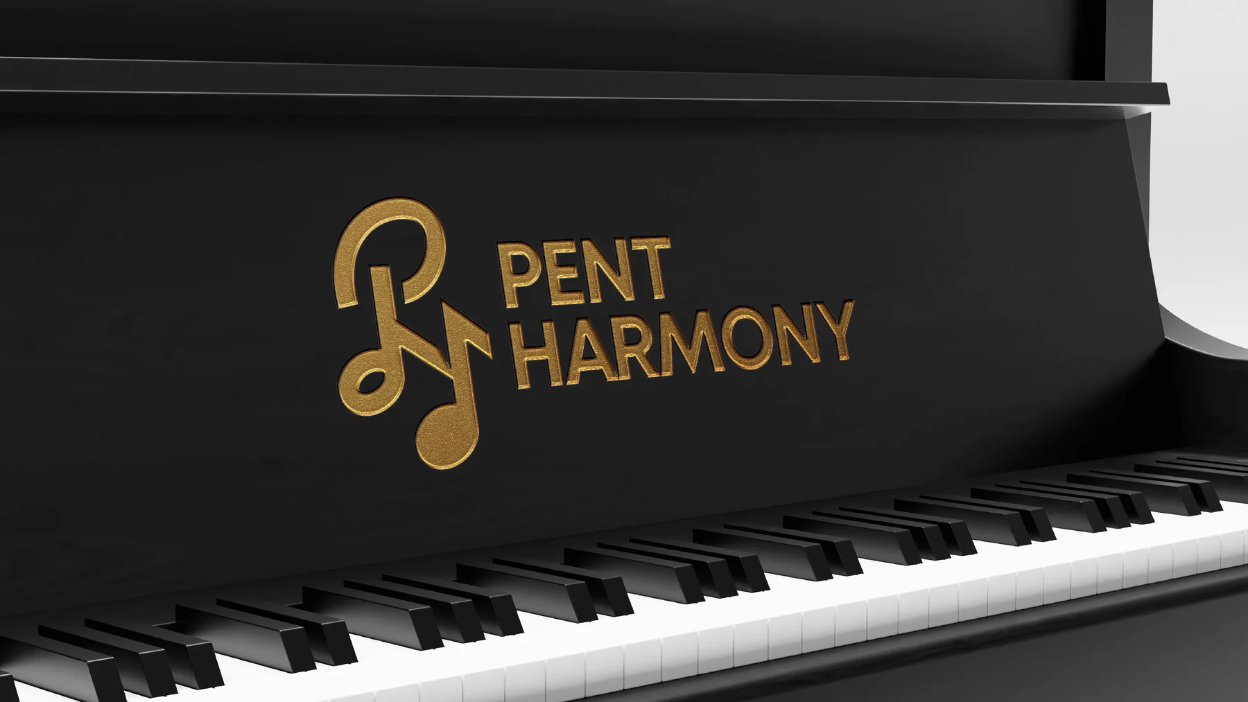
Pent Harmony
Two initials, written in music: a logo for a choir.
Pent Harmony in music

Brand board
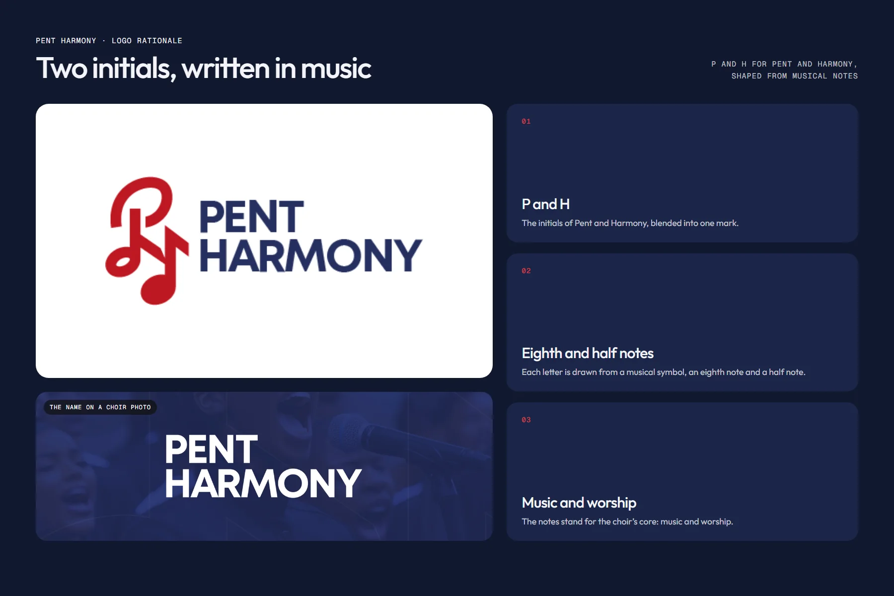
P and H, shaped from notes
a logo for the Pent Harmony choir

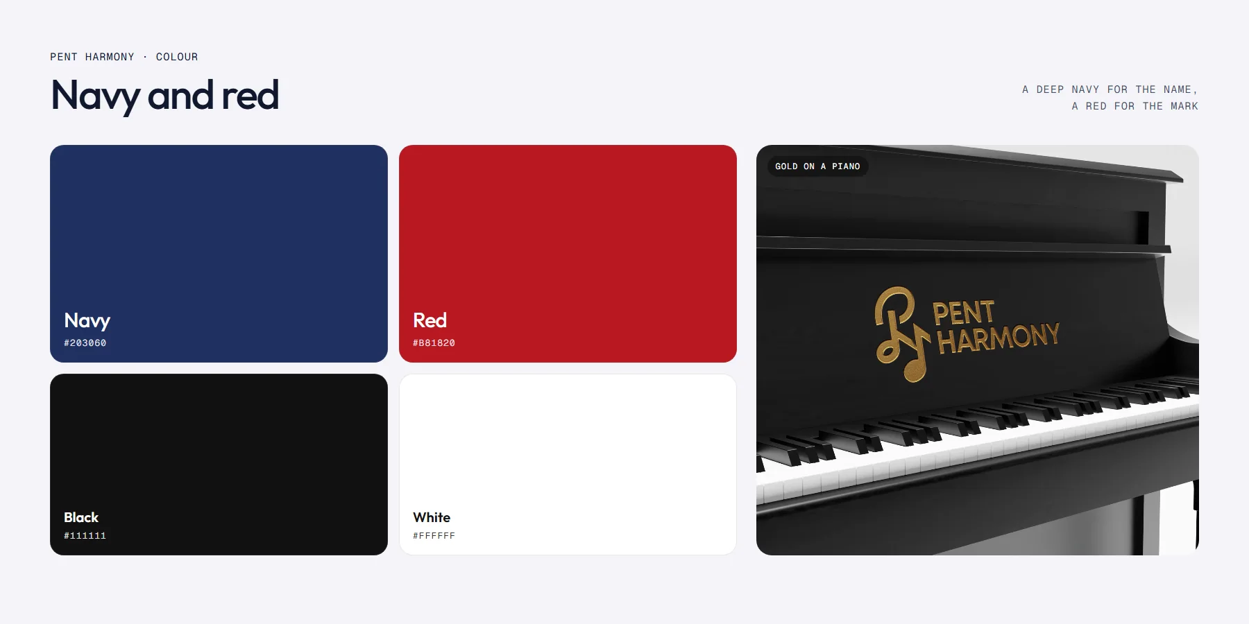
Colour
- Deep #10182F
- Accent #B81820
- Soft #F4F4F8
About
Pent Harmony is a choir. Its logo needed to say music and worship before anyone reads the name.
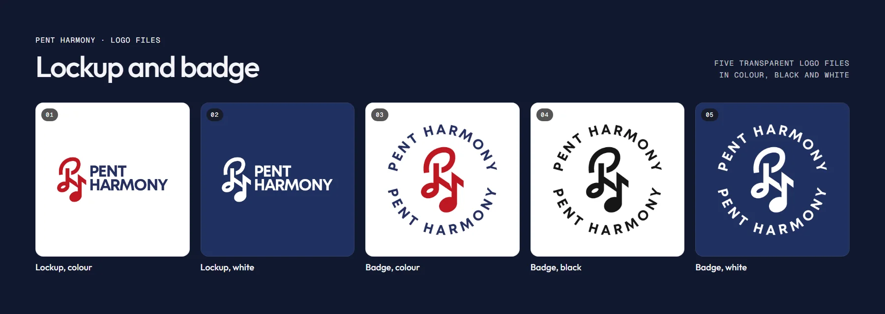
- Logo lockup
- Round badge
- Colour, black and white versions
- Logo rationale
The challenge
What needed solving
A choir’s logo appears on stage backdrops, robes and social posts, often small. It had to read as music at a glance.
What we did
- Blended the initials P and H into one mark.
- Drew each letter from a musical symbol: an eighth note and a half note.
- Set the name in a bold sans-serif in navy, with the mark in red.
- Made a round badge and black and white versions, and showed the mark in gold on a grand piano.
Delivered
- Logo lockup
- Round badge
- Colour, black and white versions
- Logo rationale
Thanks for looking. Want one like this?