( Energy ) 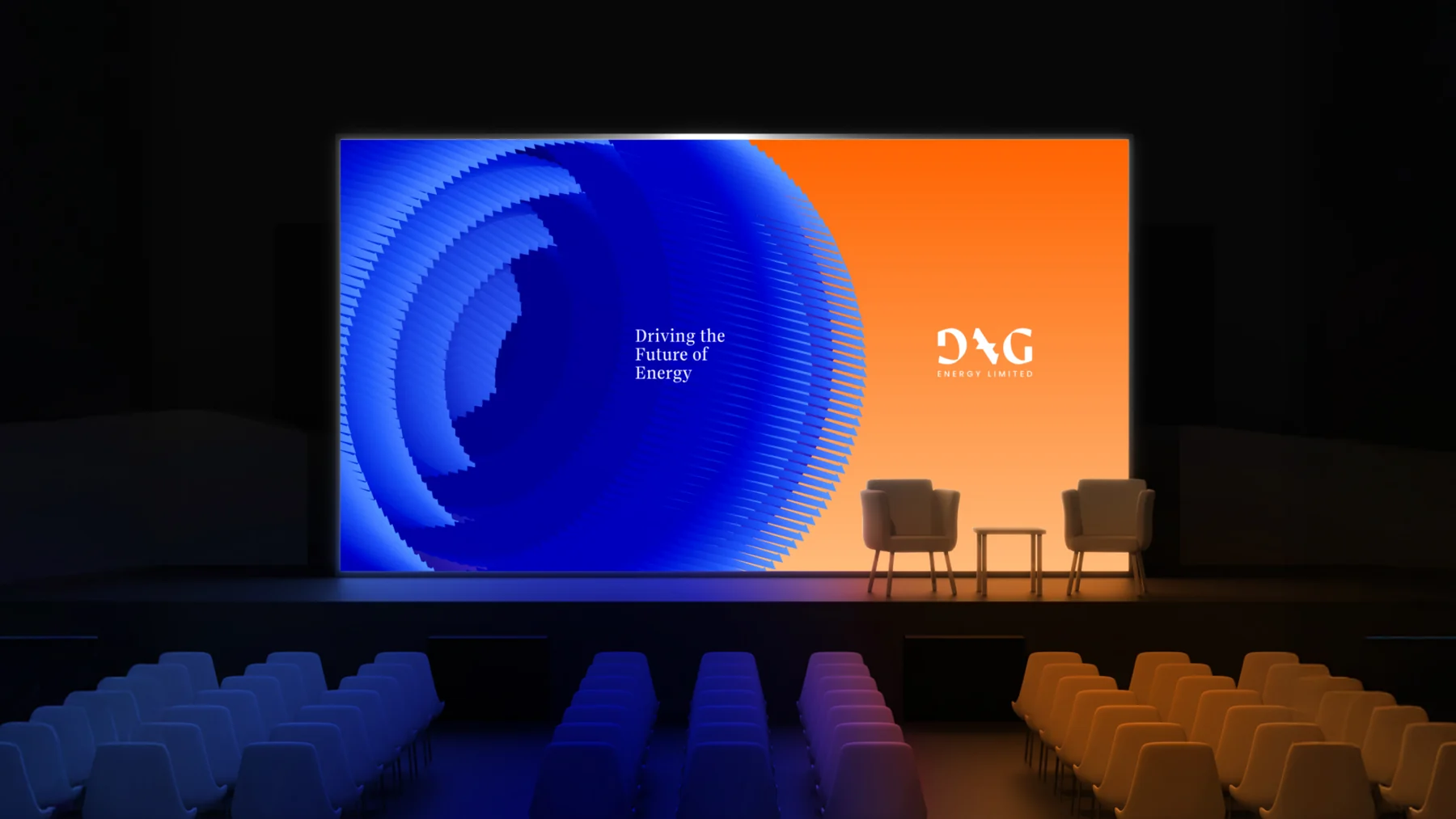
Dag Energy
Driving the Future of Energy: an identity for a Nigerian energy company.
Driving the future of energy
Brand board
One glyph for every kind of energy
brand strategy and identity for Dag Energy Limited
Colour
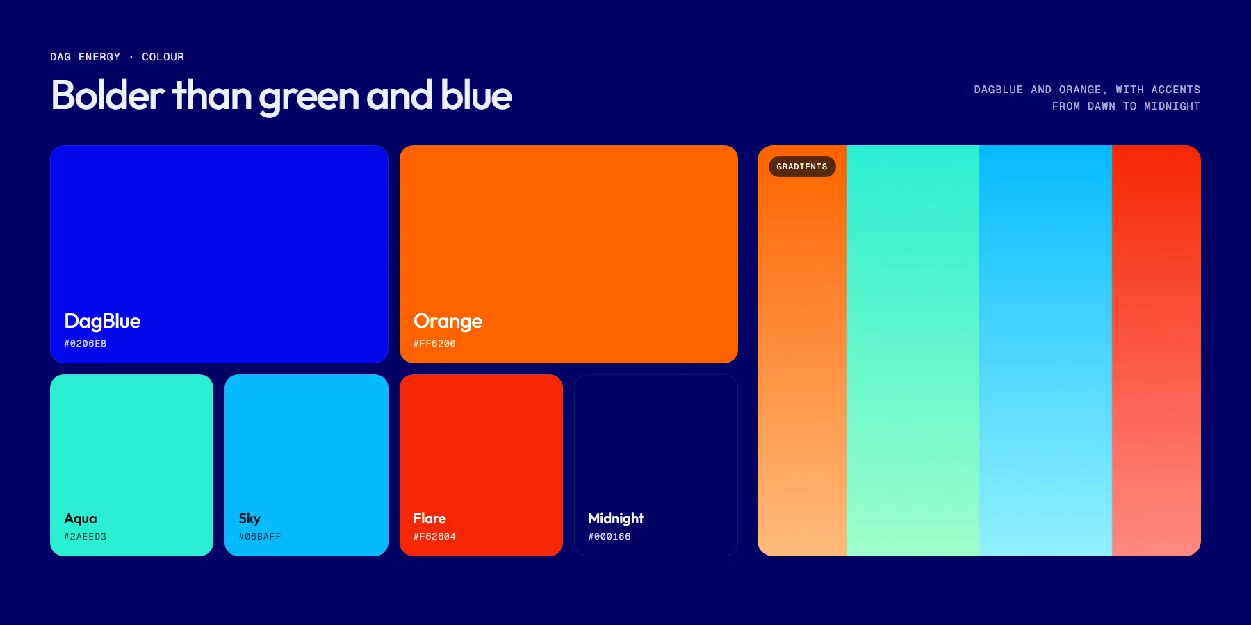
- Deep #000166
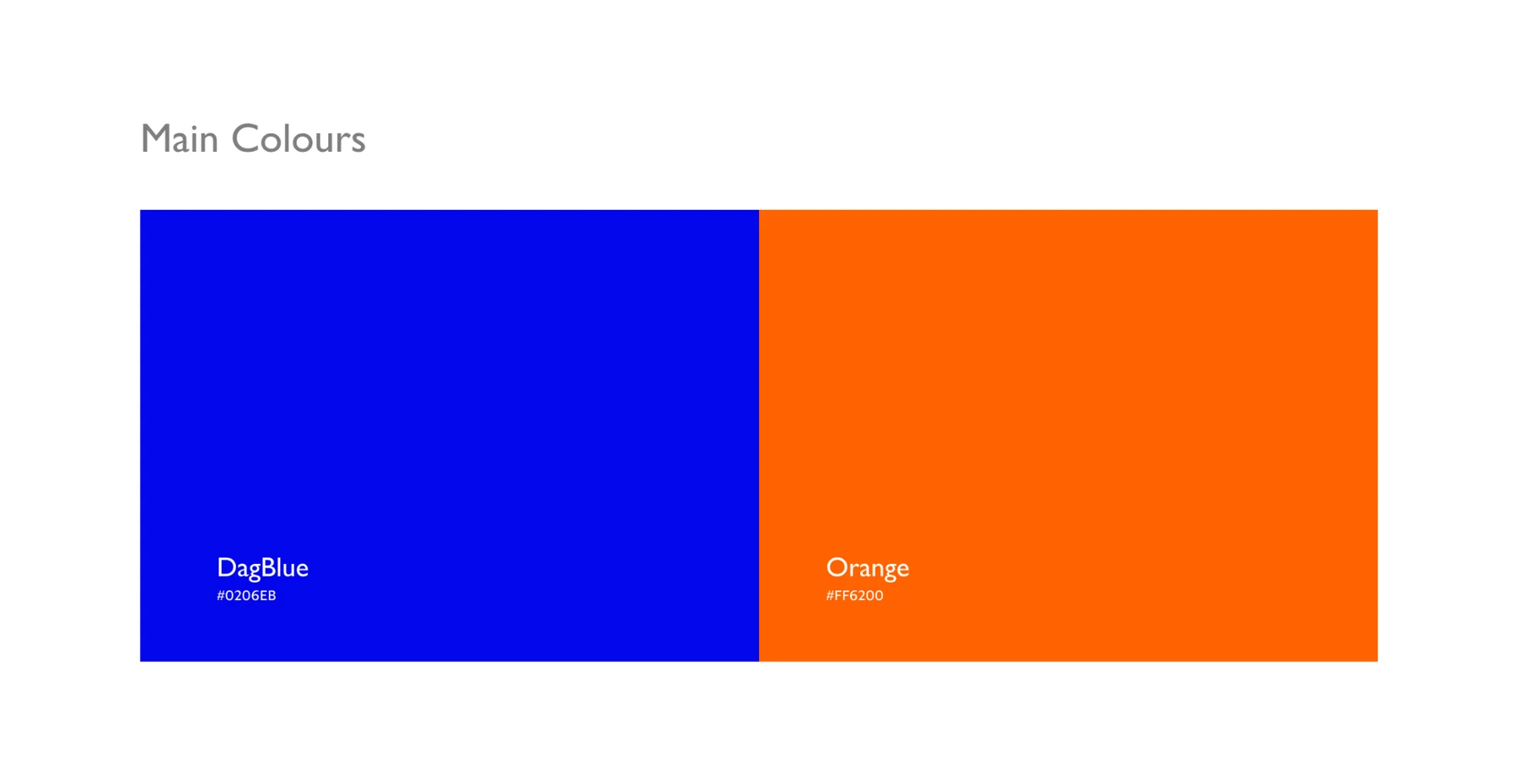
- Accent #0206EB
- Soft #EEF0FF

About
Dag Energy Limited is a Nigerian energy company working across fossil, renewable and emerging technologies, with the purpose of redefining how energy is sourced, transferred and experienced. We created its brand strategy and identity.
- Brand platform
- Logo and glyph
- Colour and gradients
- Key graphic
- 3D motion
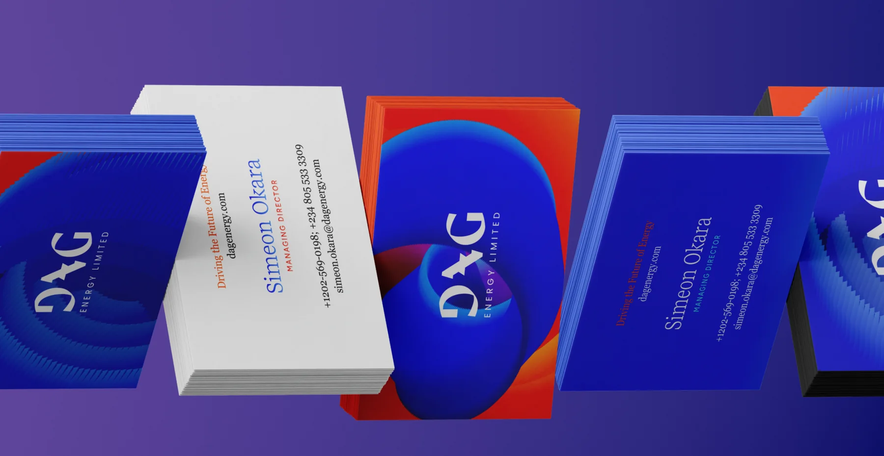
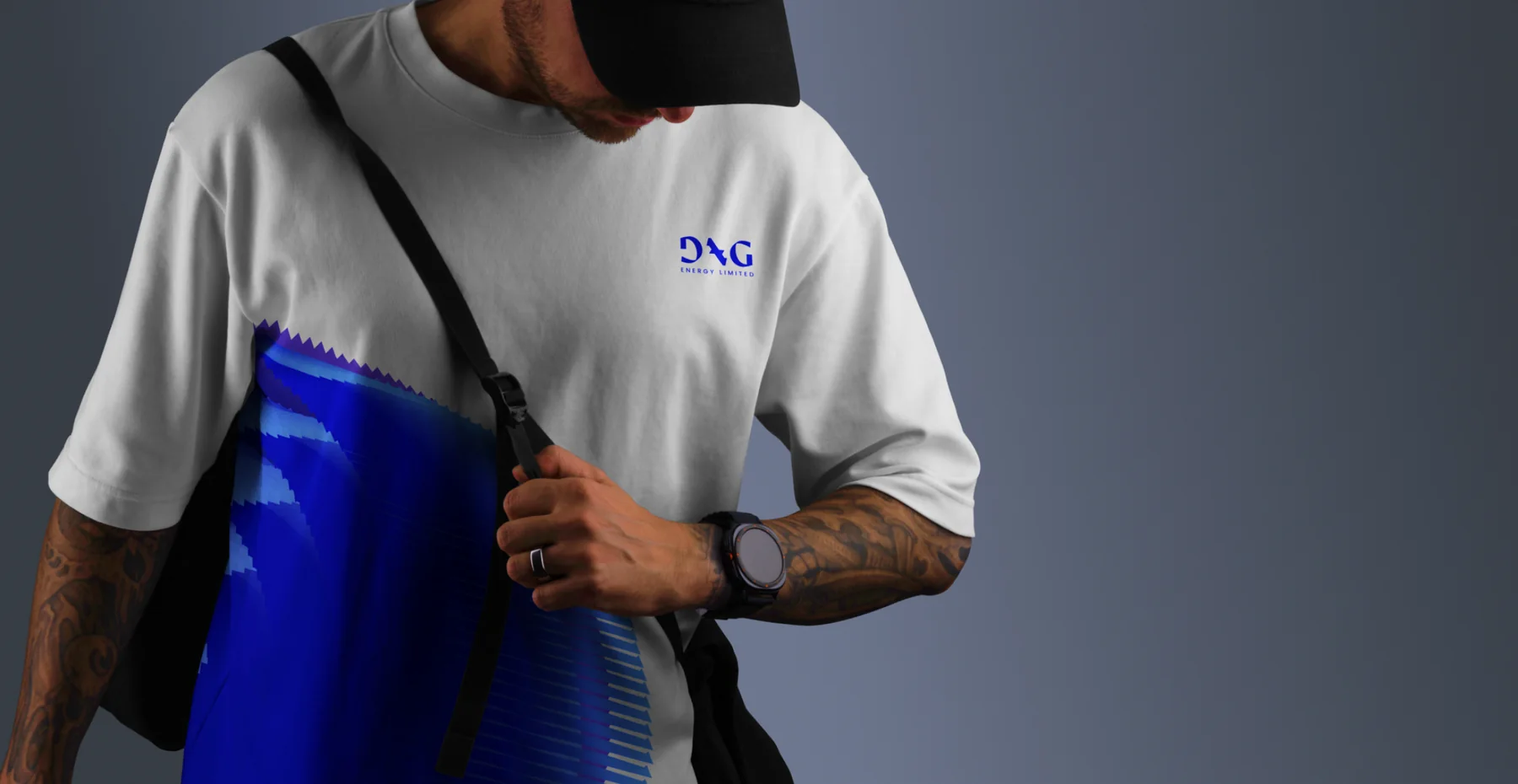
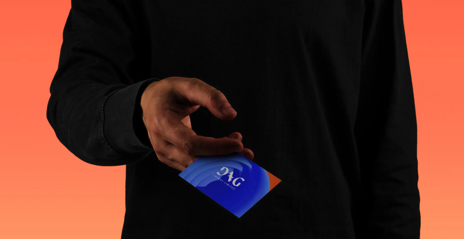
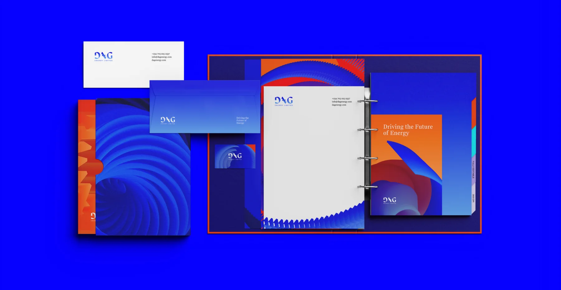
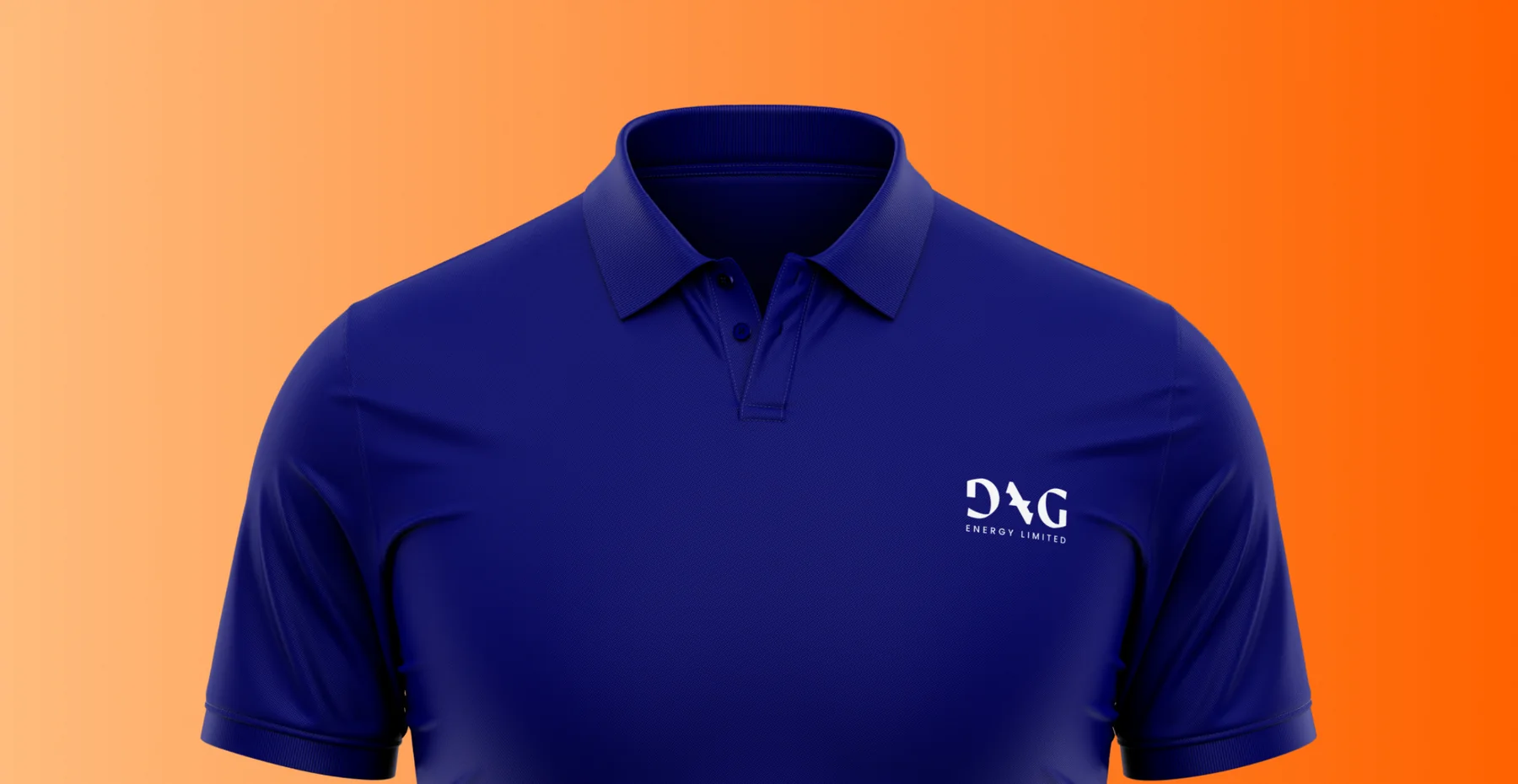
- Stationery, workwear and signage
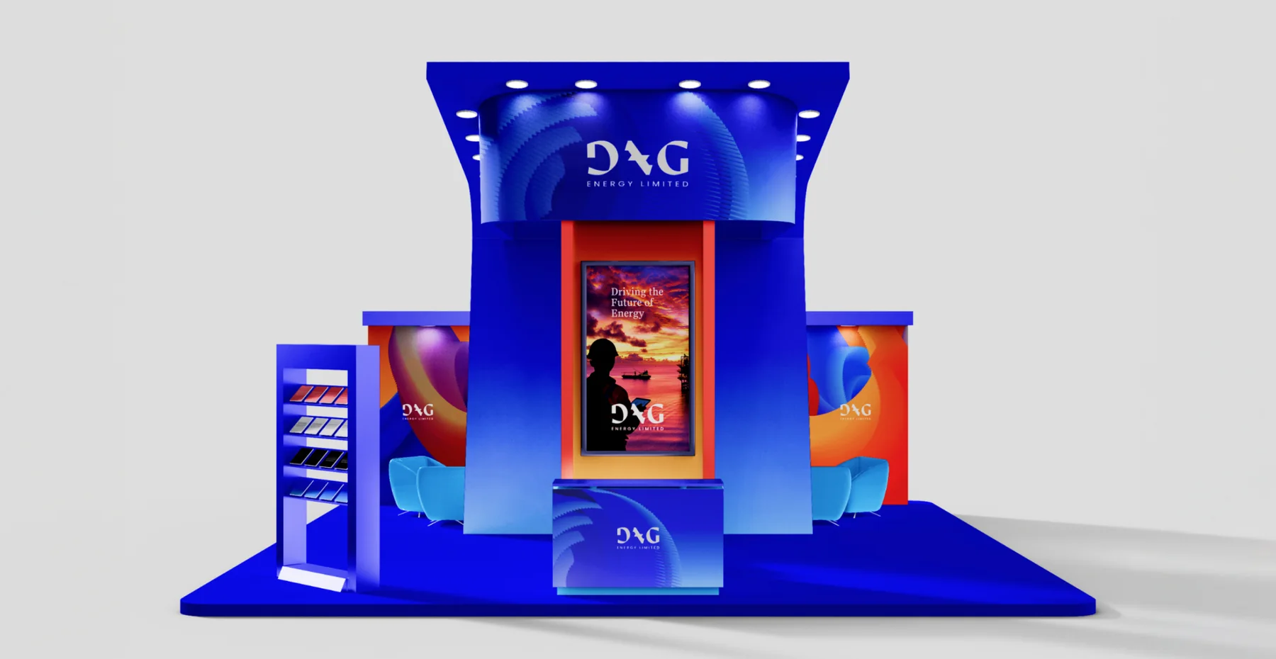
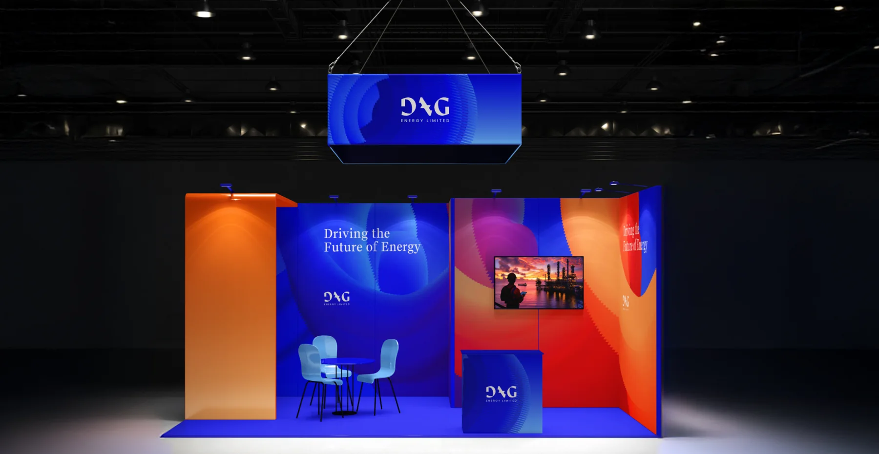
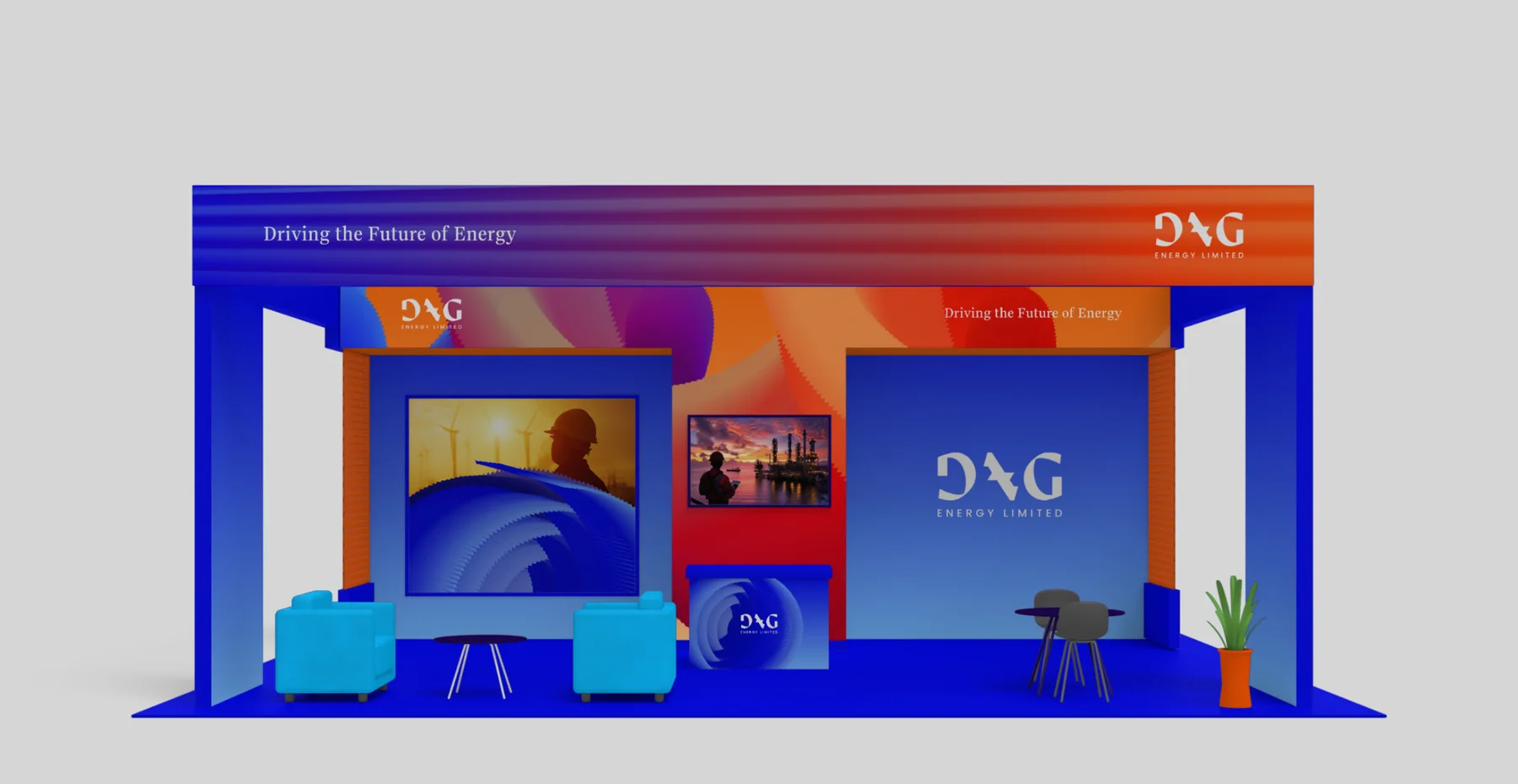
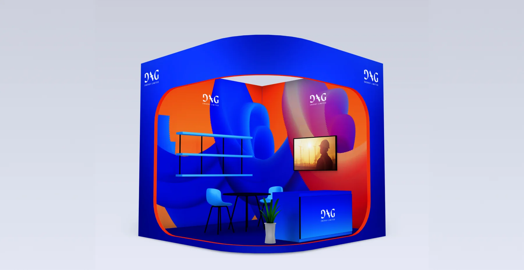
- Exhibition booths
The challenge
What needed solving
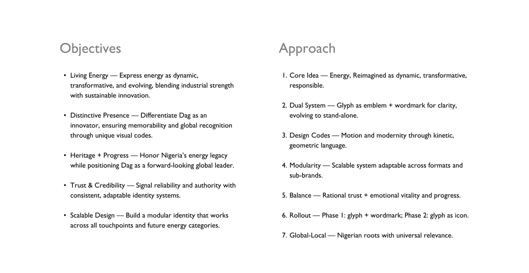
Express energy as dynamic and evolving, honour Nigeria’s energy heritage while positioning Dag as a forward-looking leader, and build a modular identity that works across every touchpoint and future energy category.
What we did
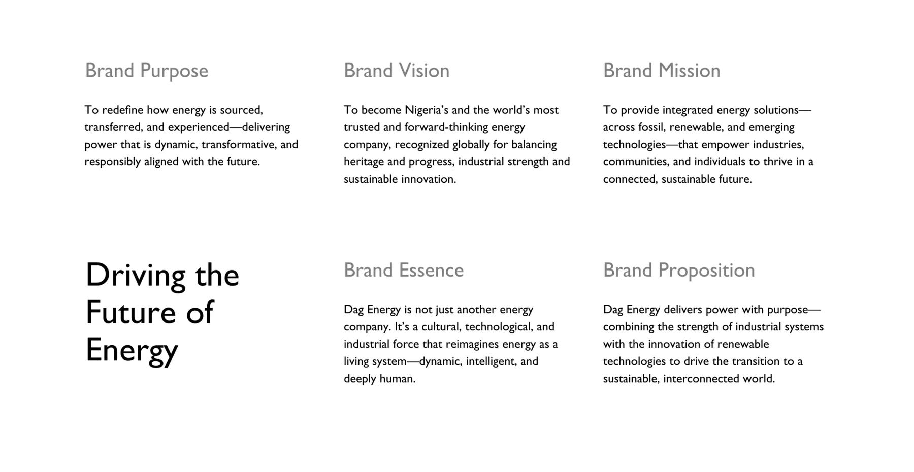
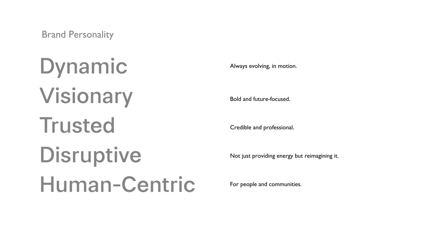
- Defined the brand platform: purpose, vision, mission, essence, personality and the line Driving the Future of Energy.
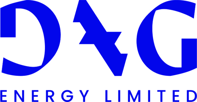
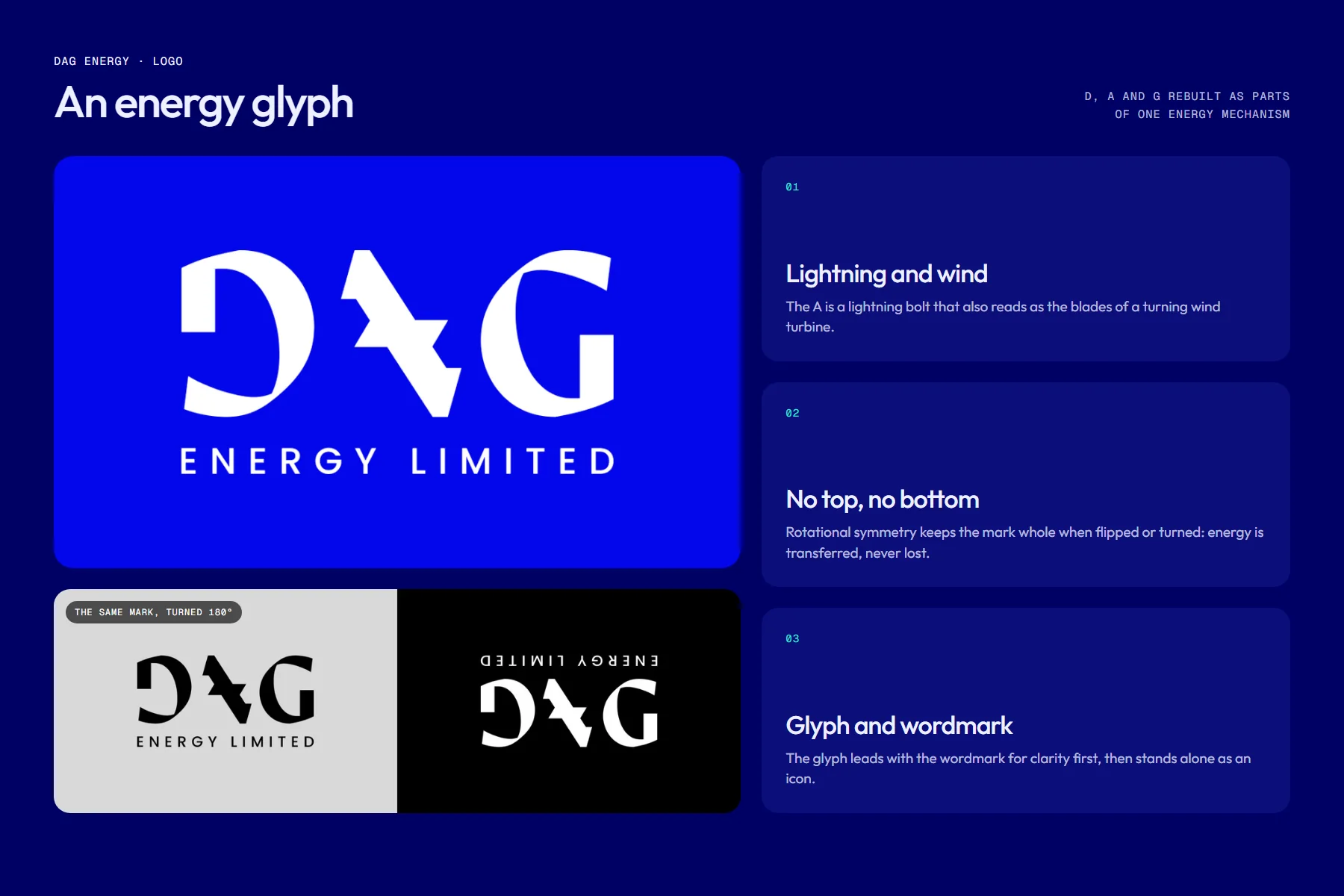
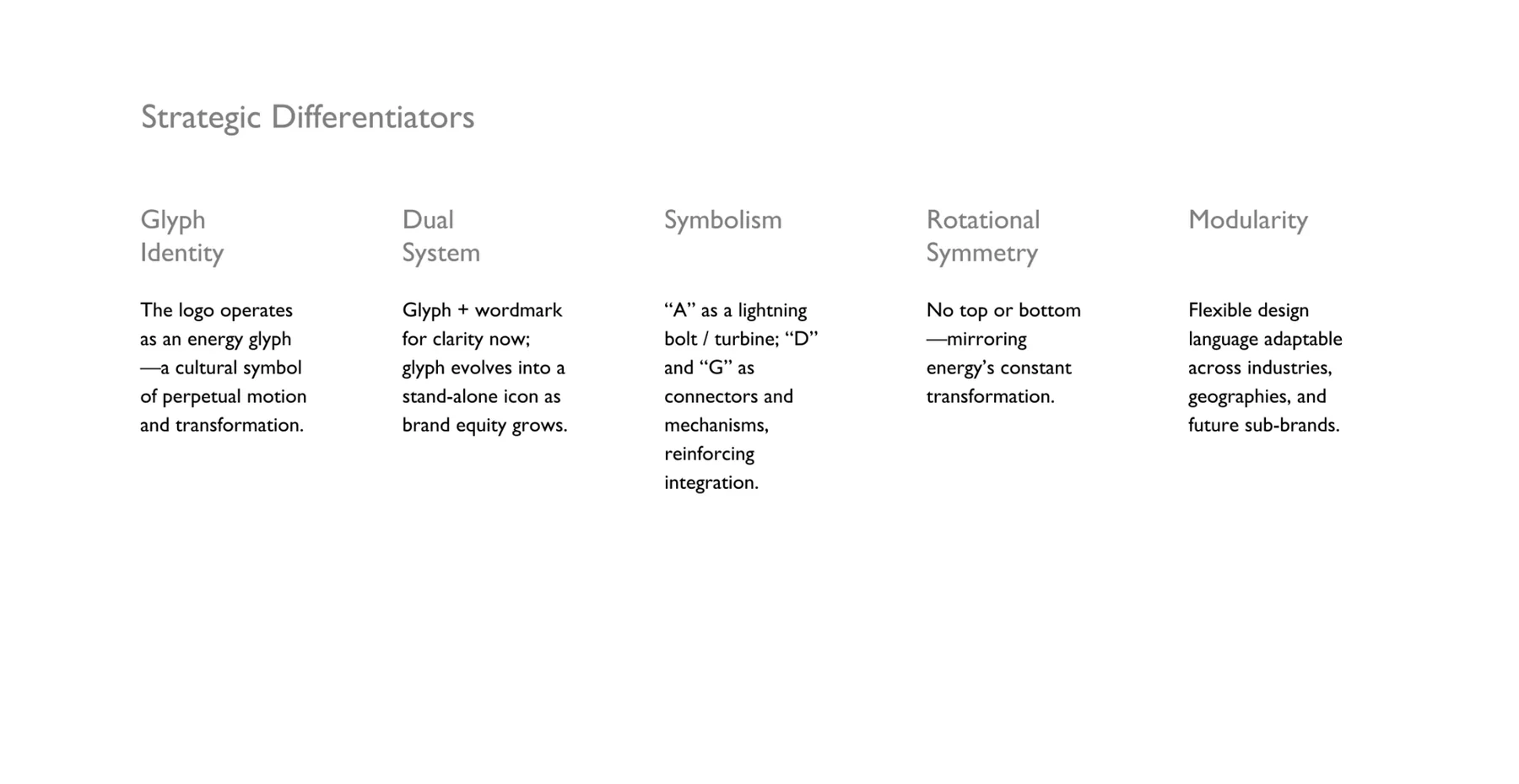
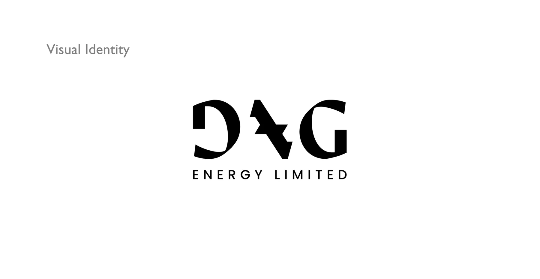
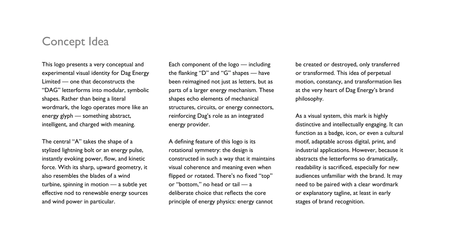
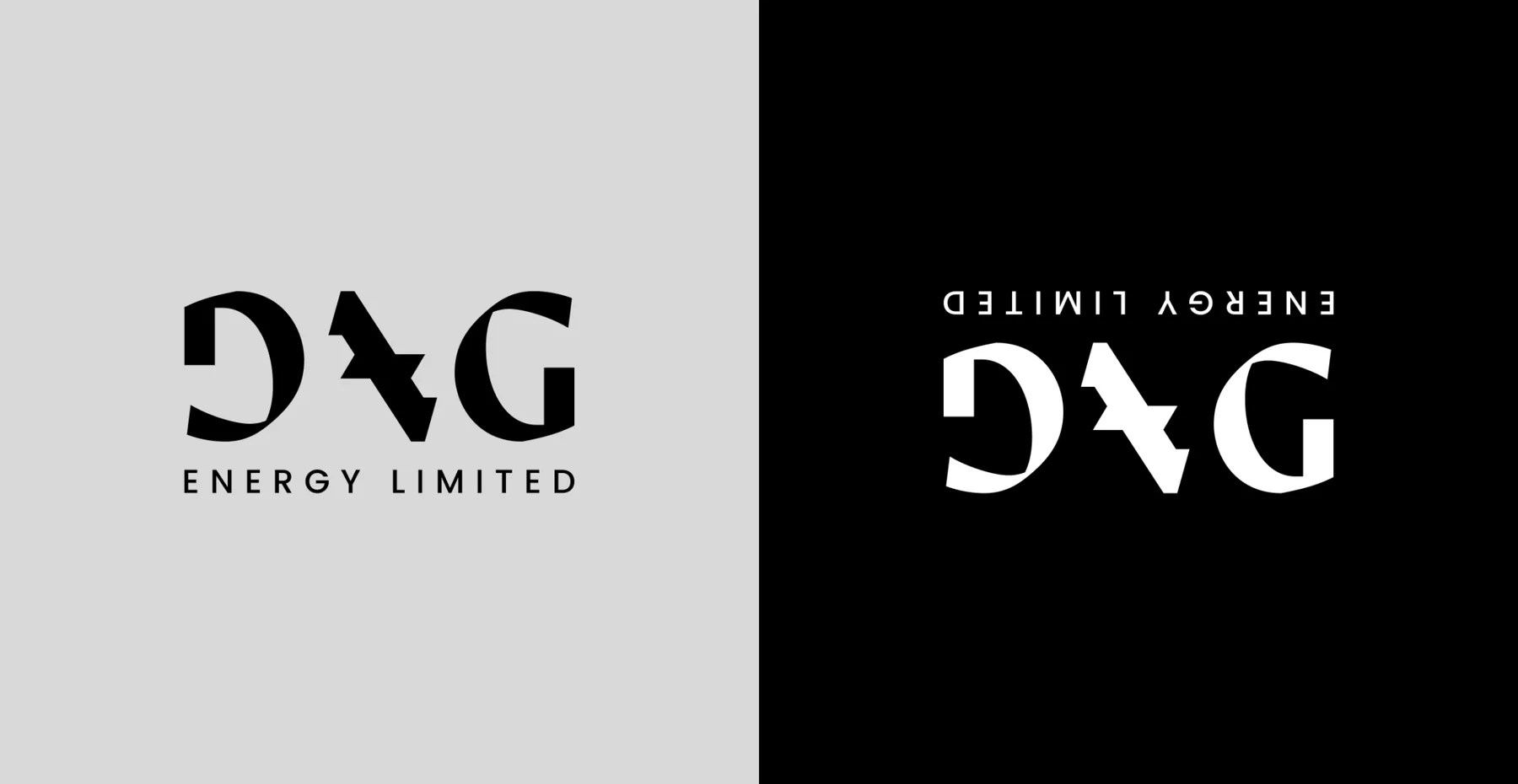
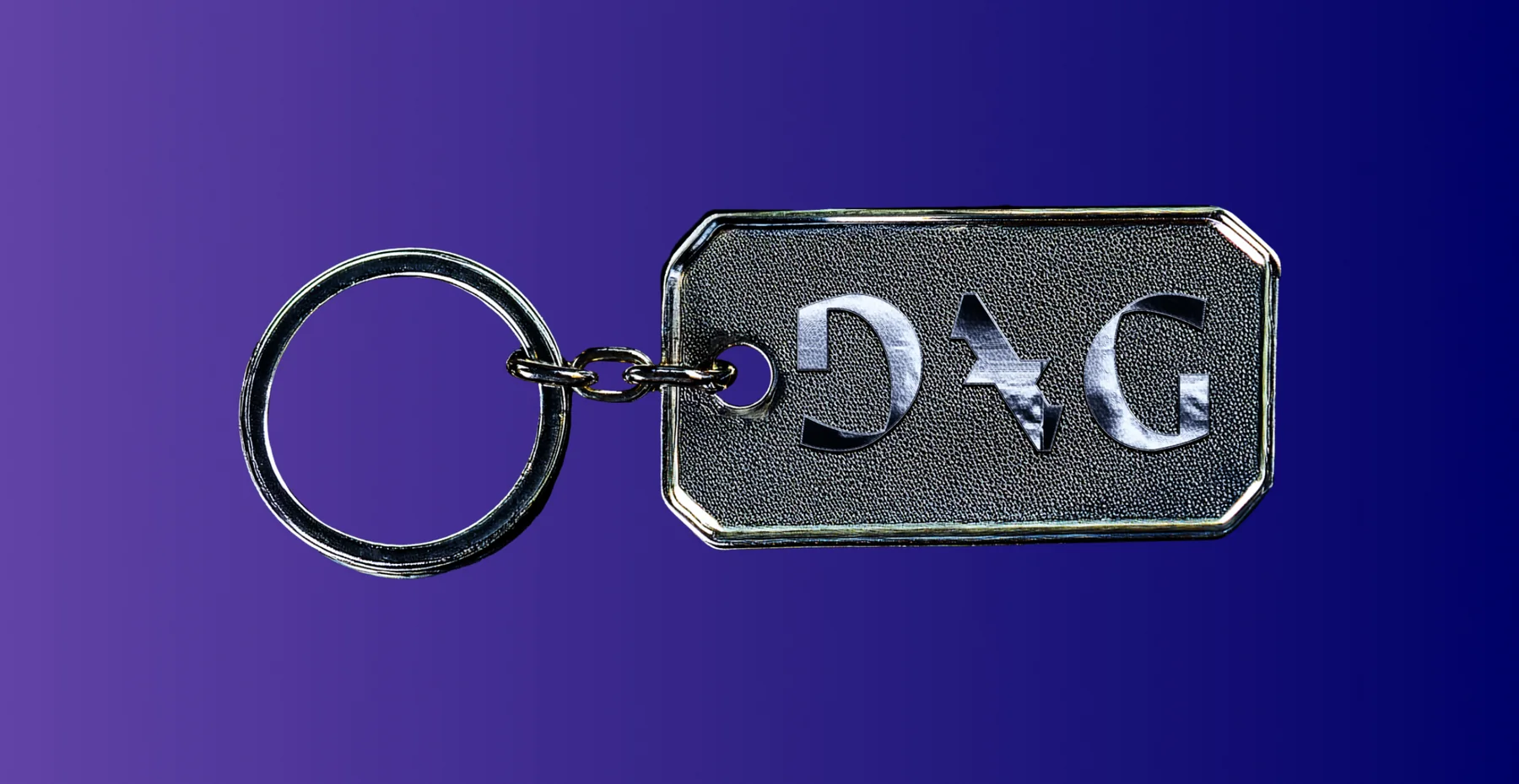
- Drew the logo as an energy glyph: the A is a lightning bolt that also reads as a turning wind turbine, and the D and G work as connectors in a larger mechanism.
- Built the mark with rotational symmetry, so it holds its meaning flipped or turned: energy is transferred, never lost.
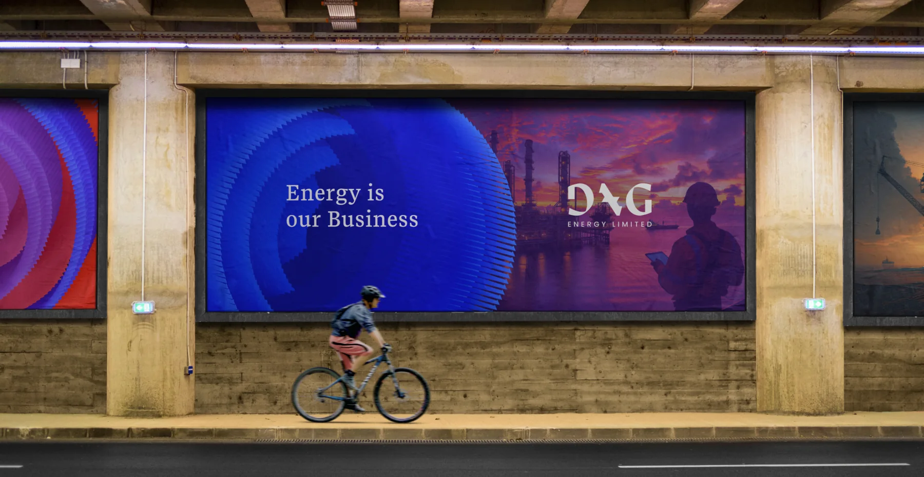
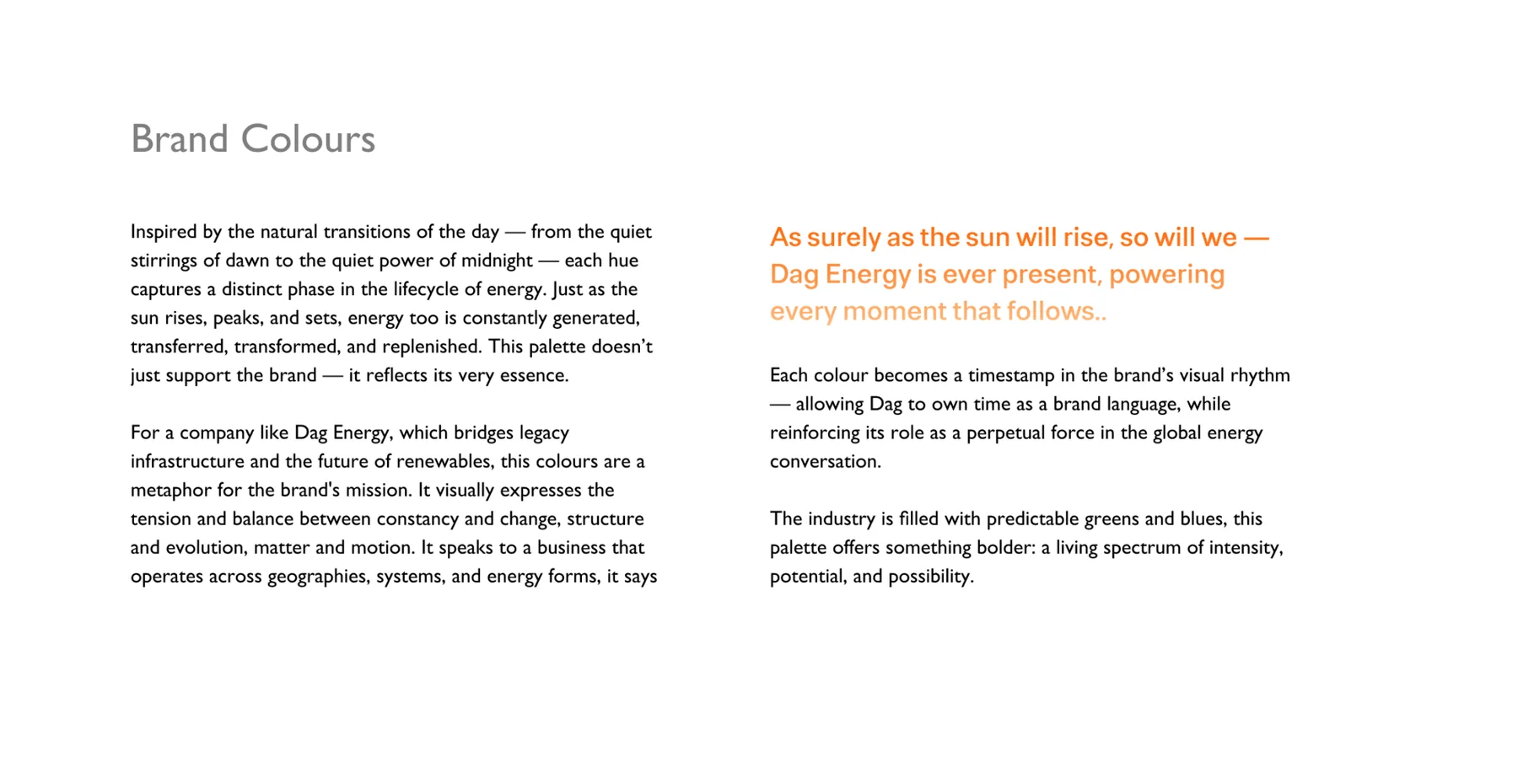
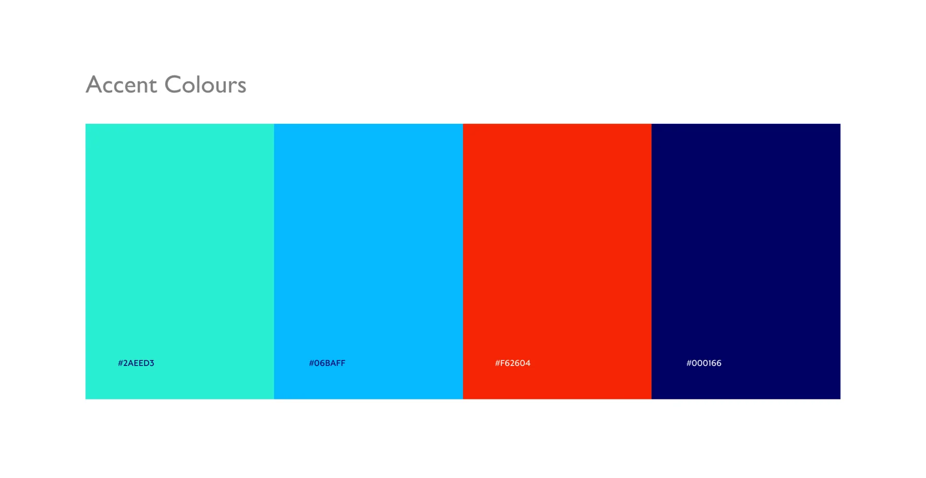
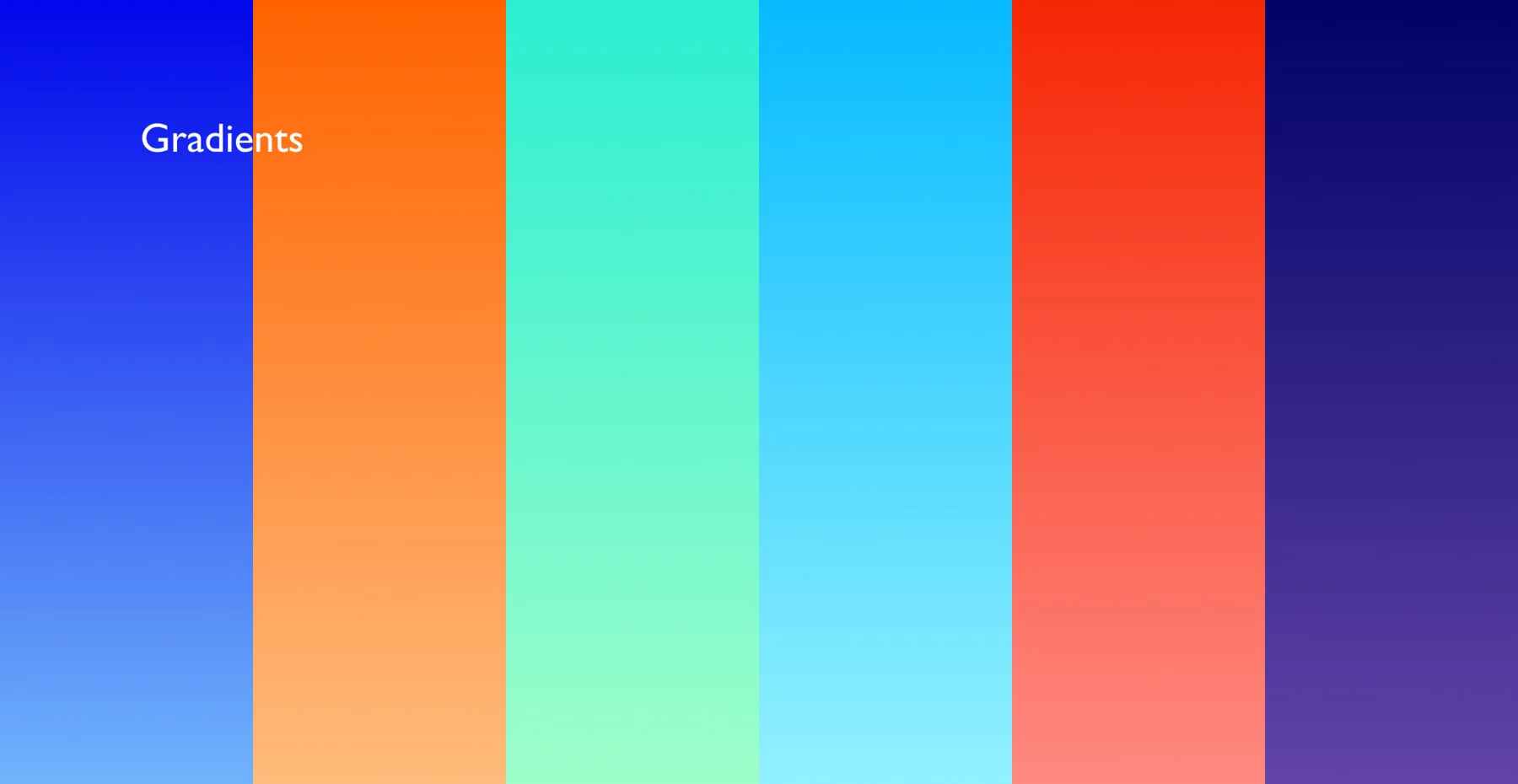
- Chose DagBlue and orange over the industry’s usual greens and blues, with aqua, sky, flare and midnight accents and gradients.
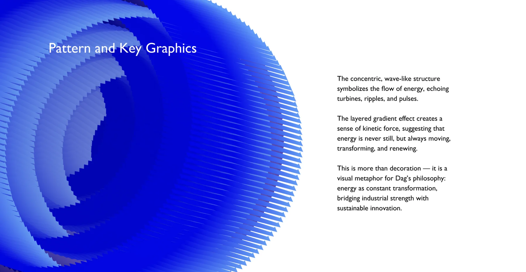
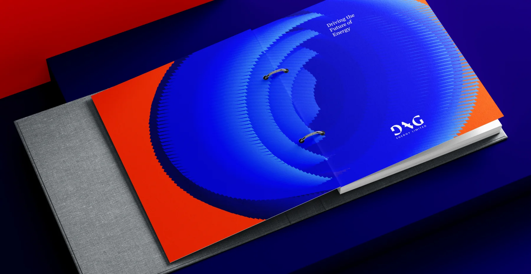
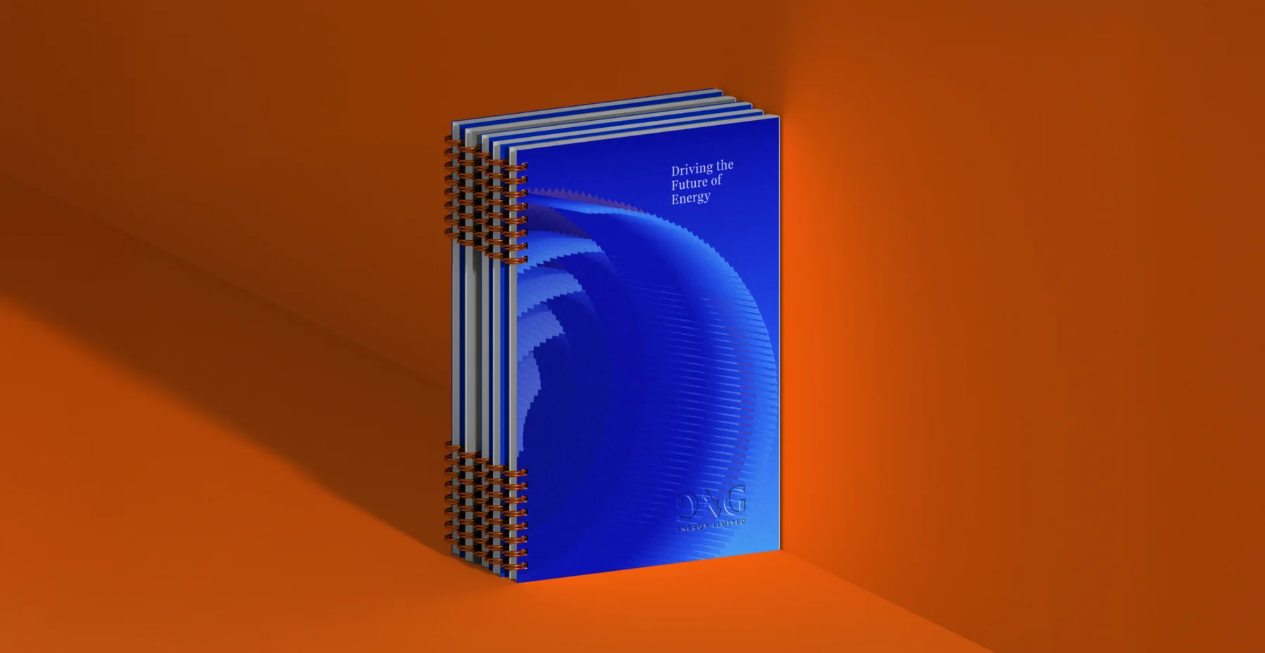
- Modelled the glyph in 3D in Blender and twisted it into the concentric key graphic and a short motion piece.
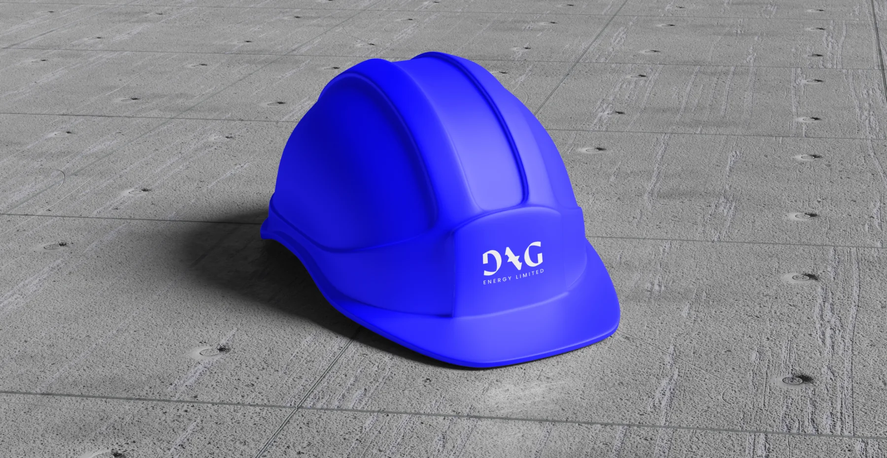
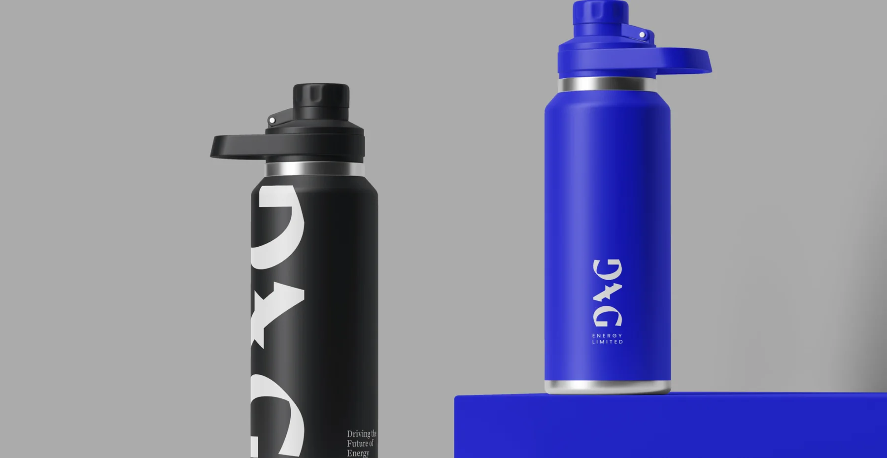
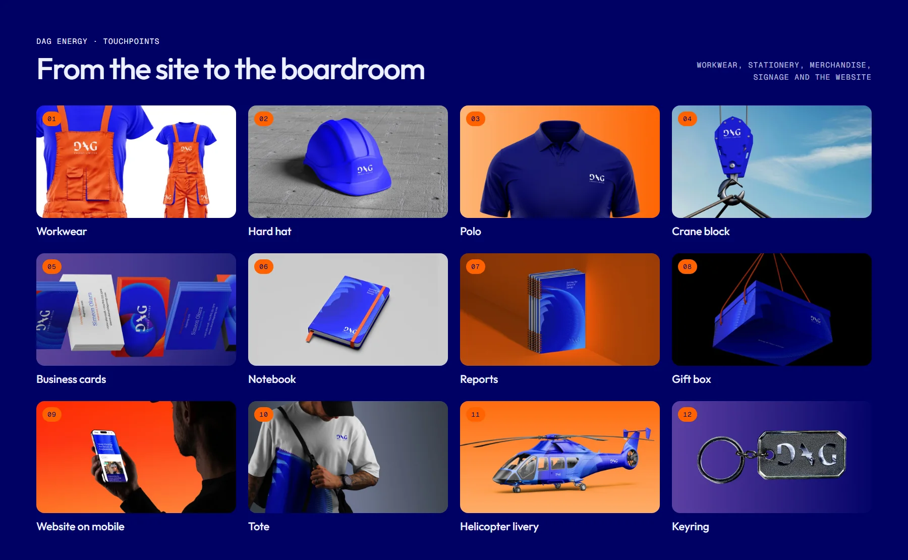
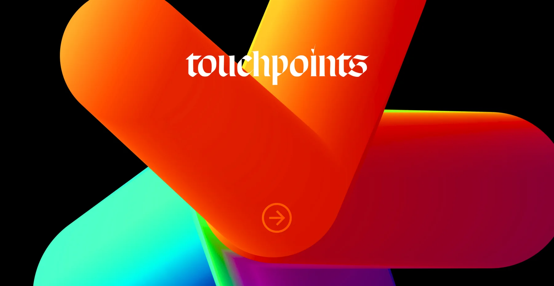
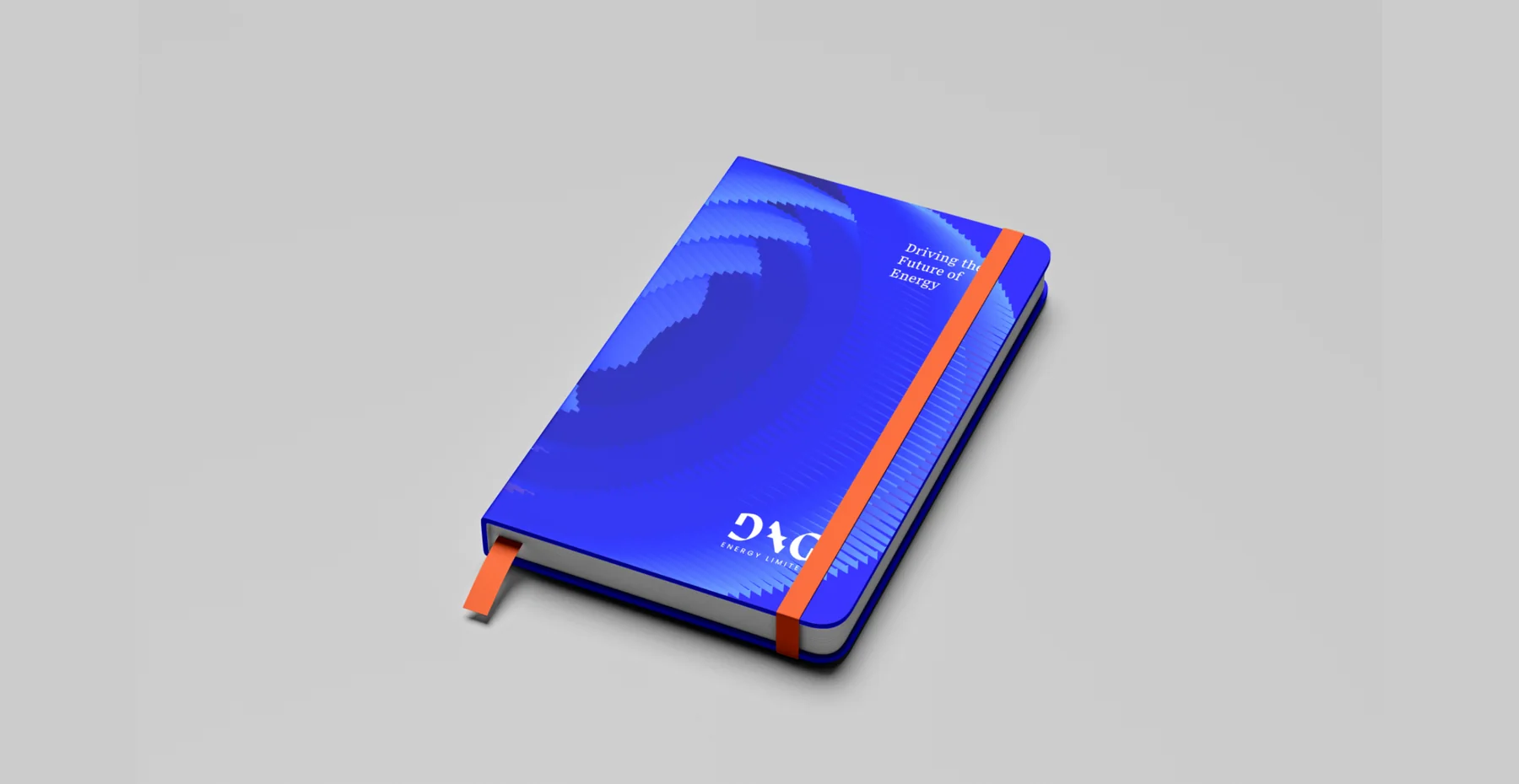
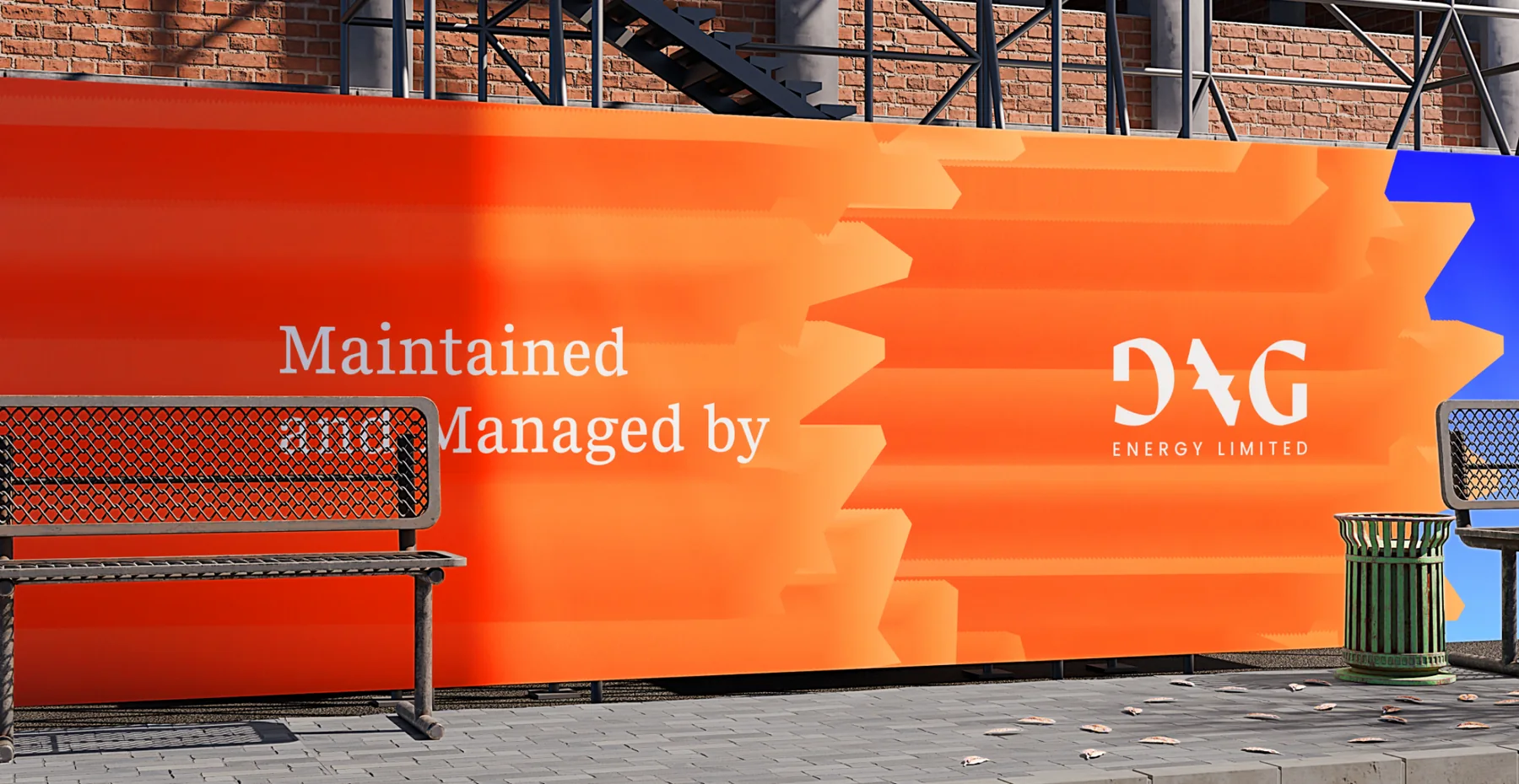
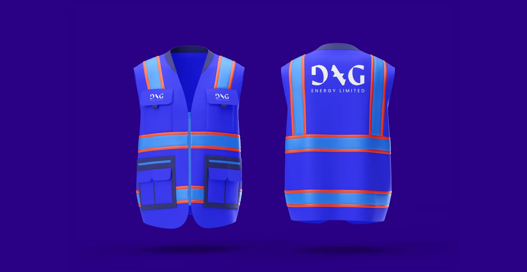
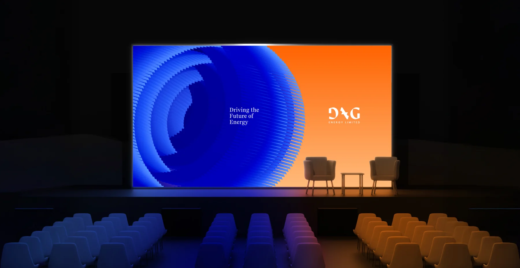
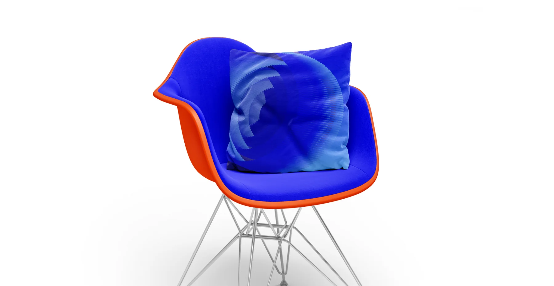
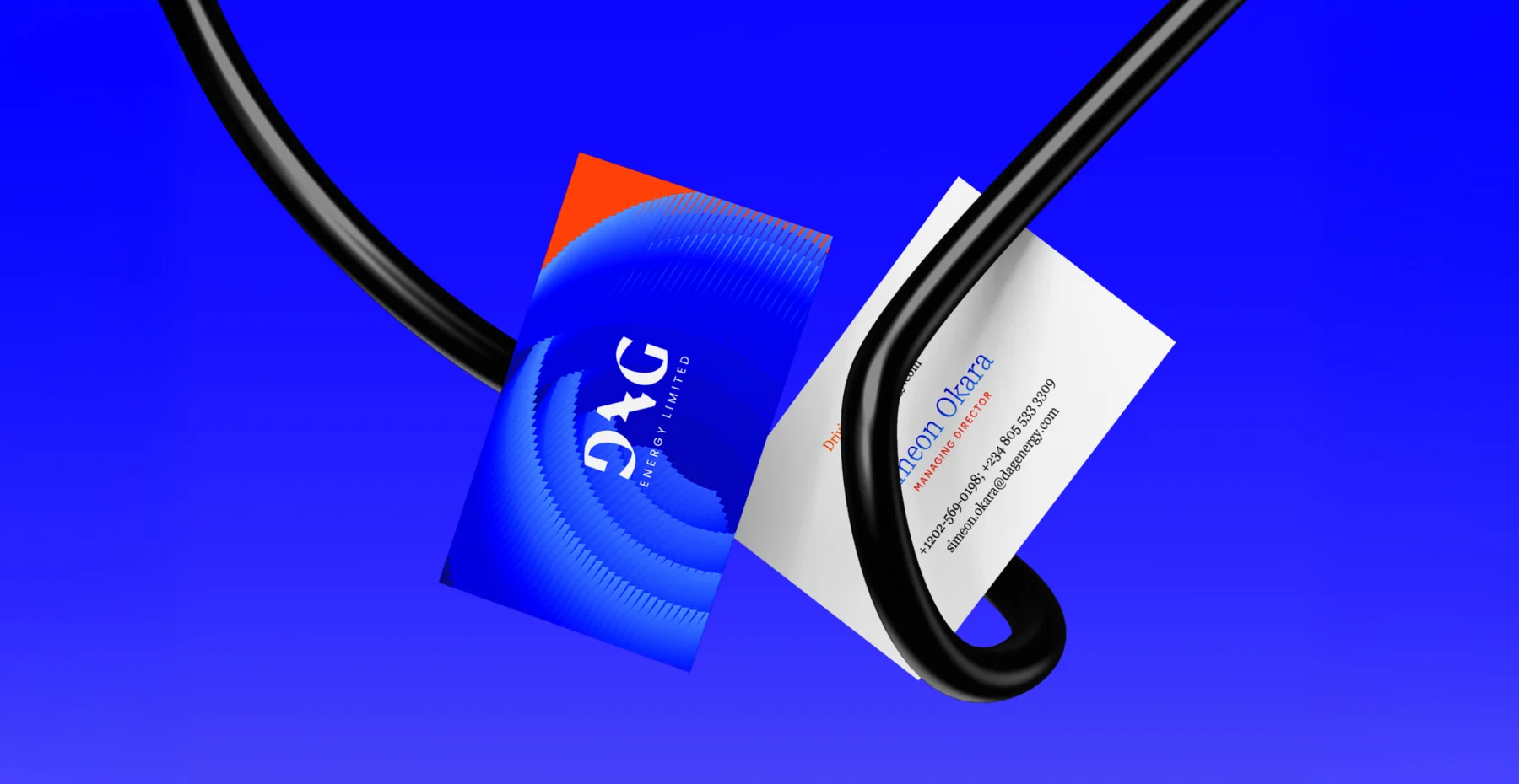
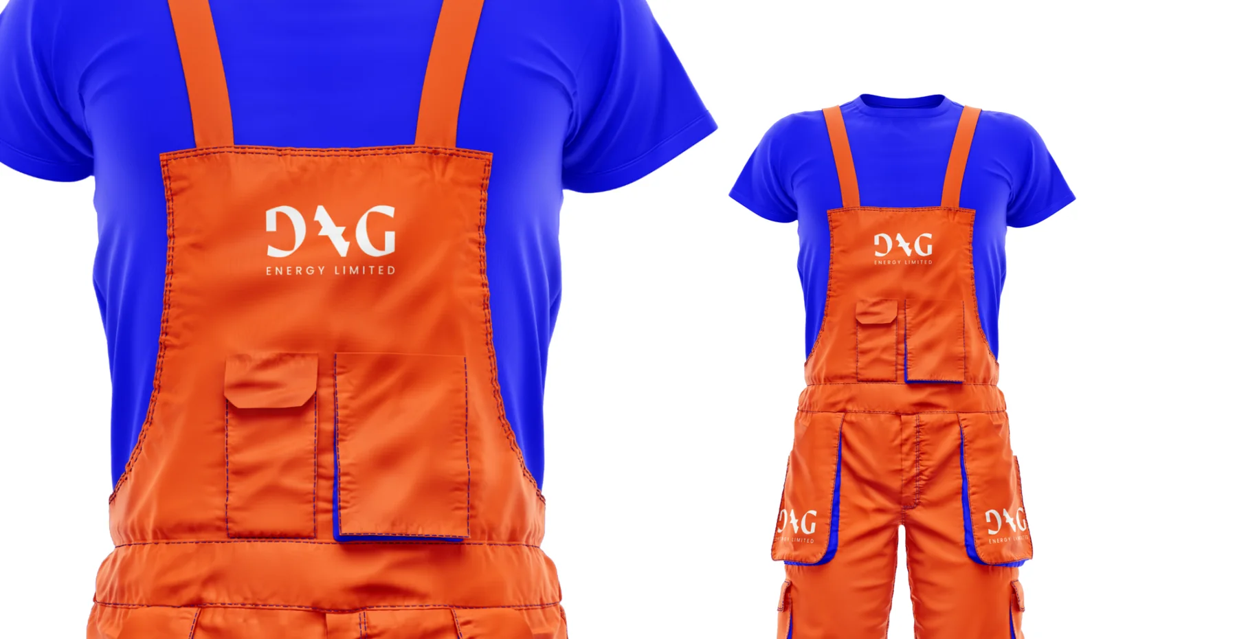
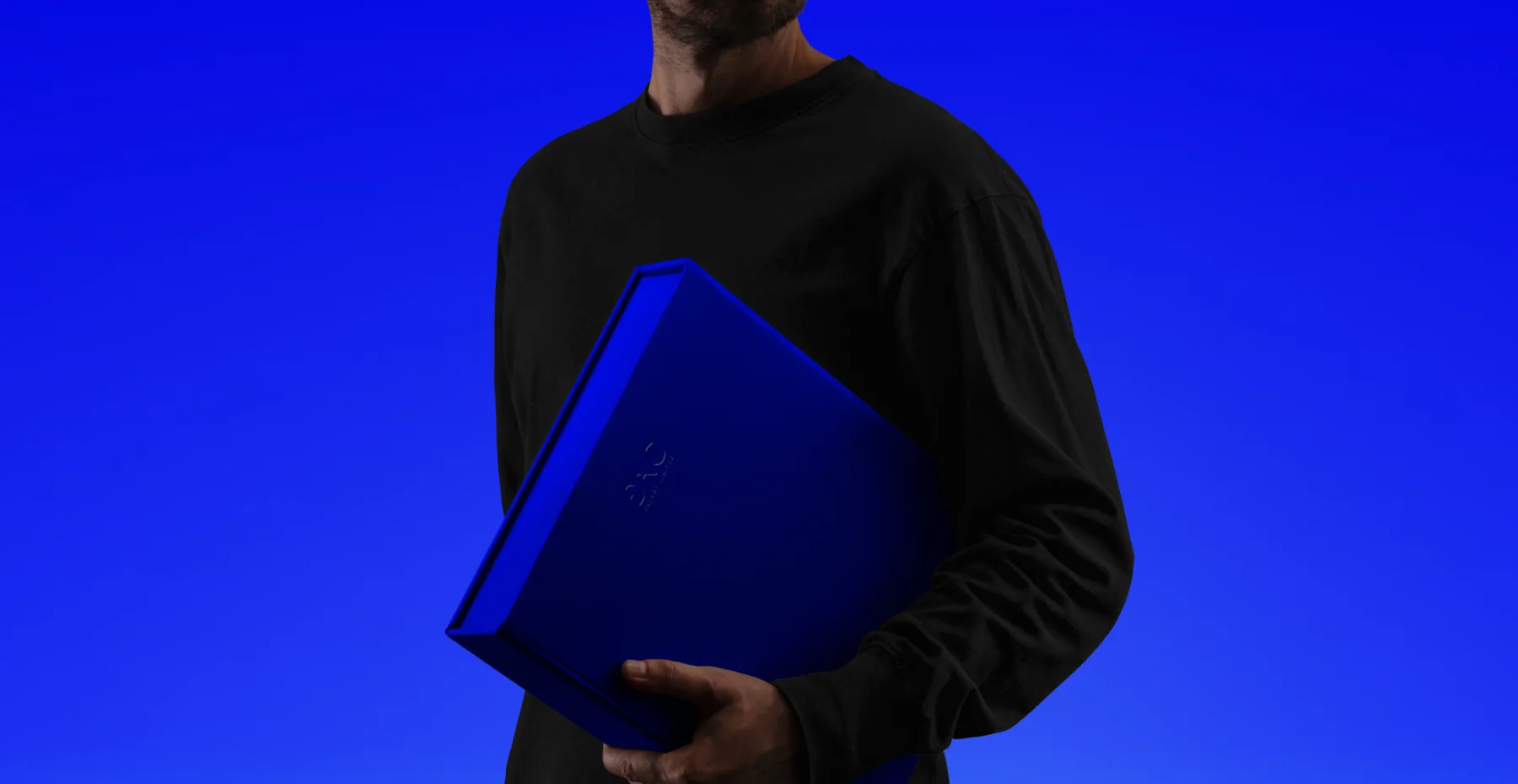
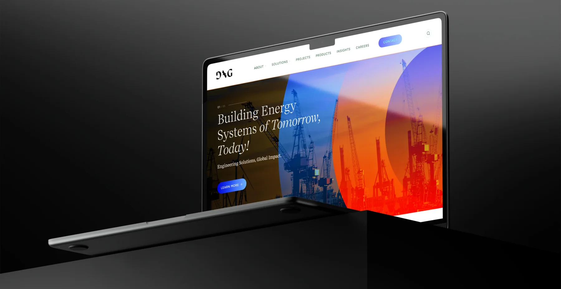
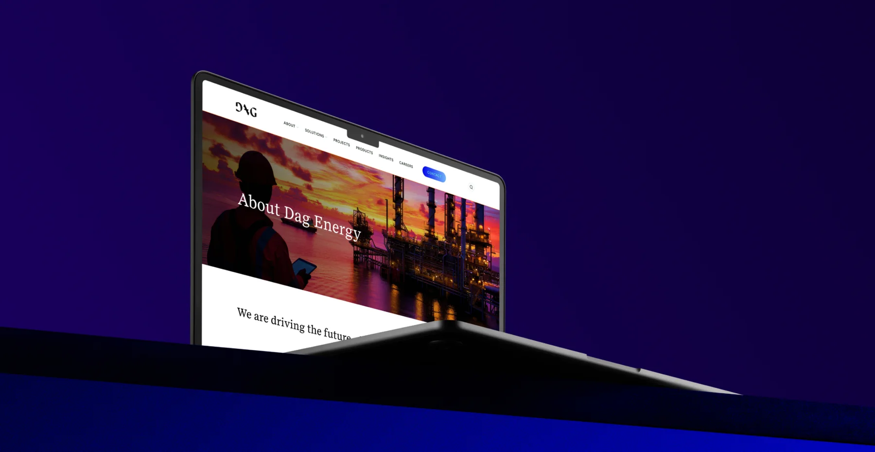
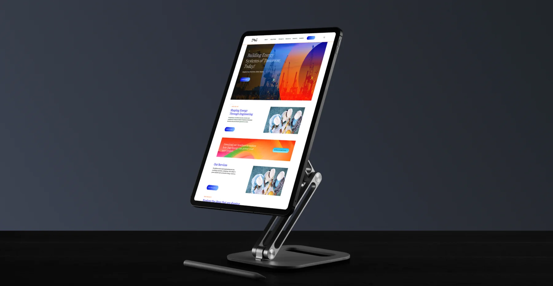
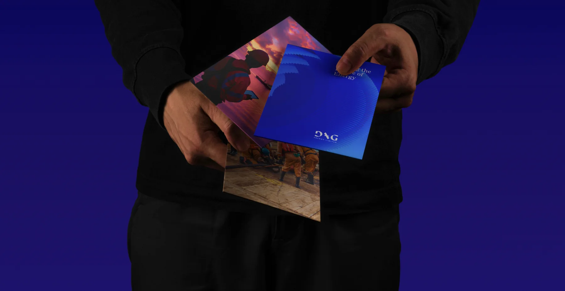
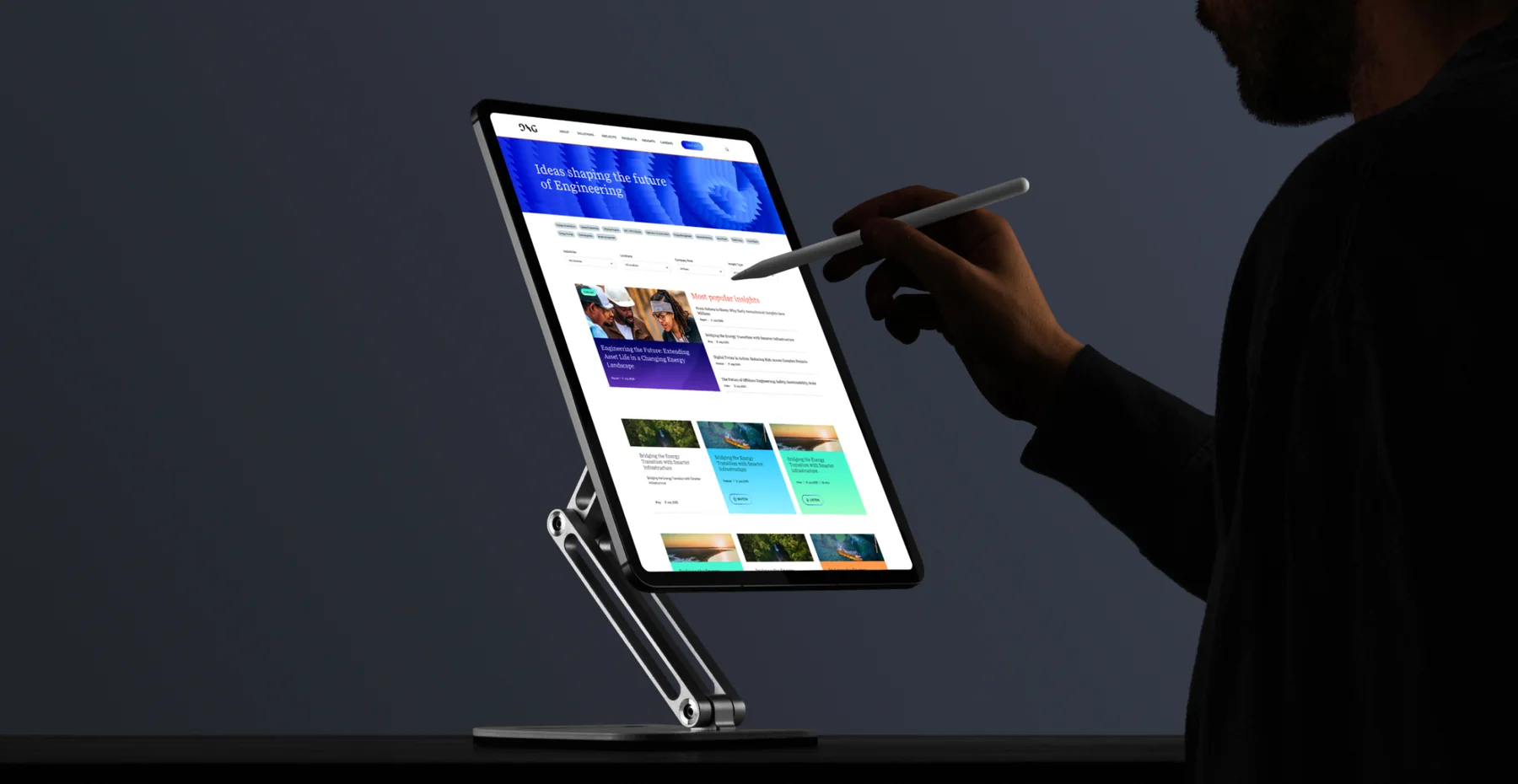
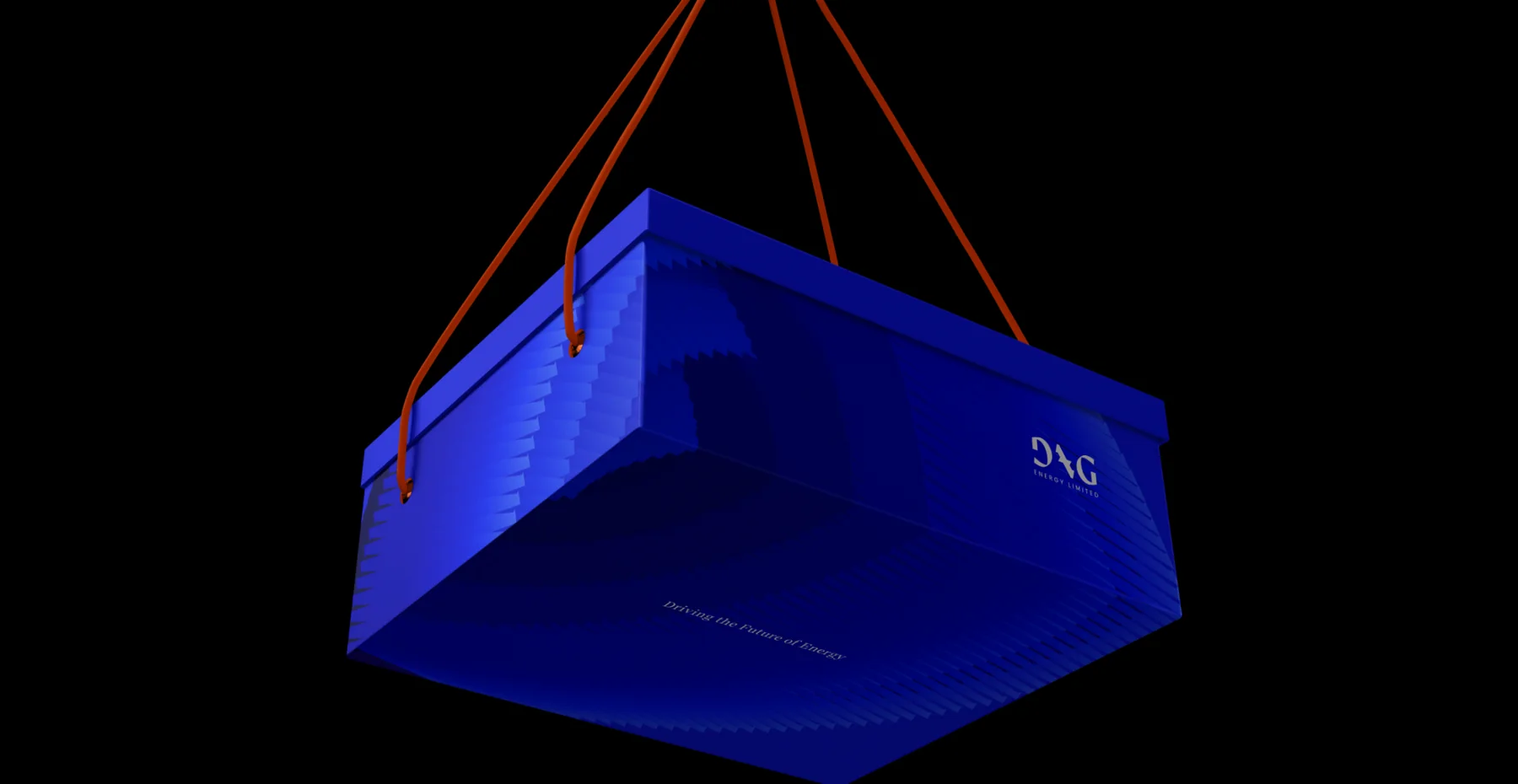
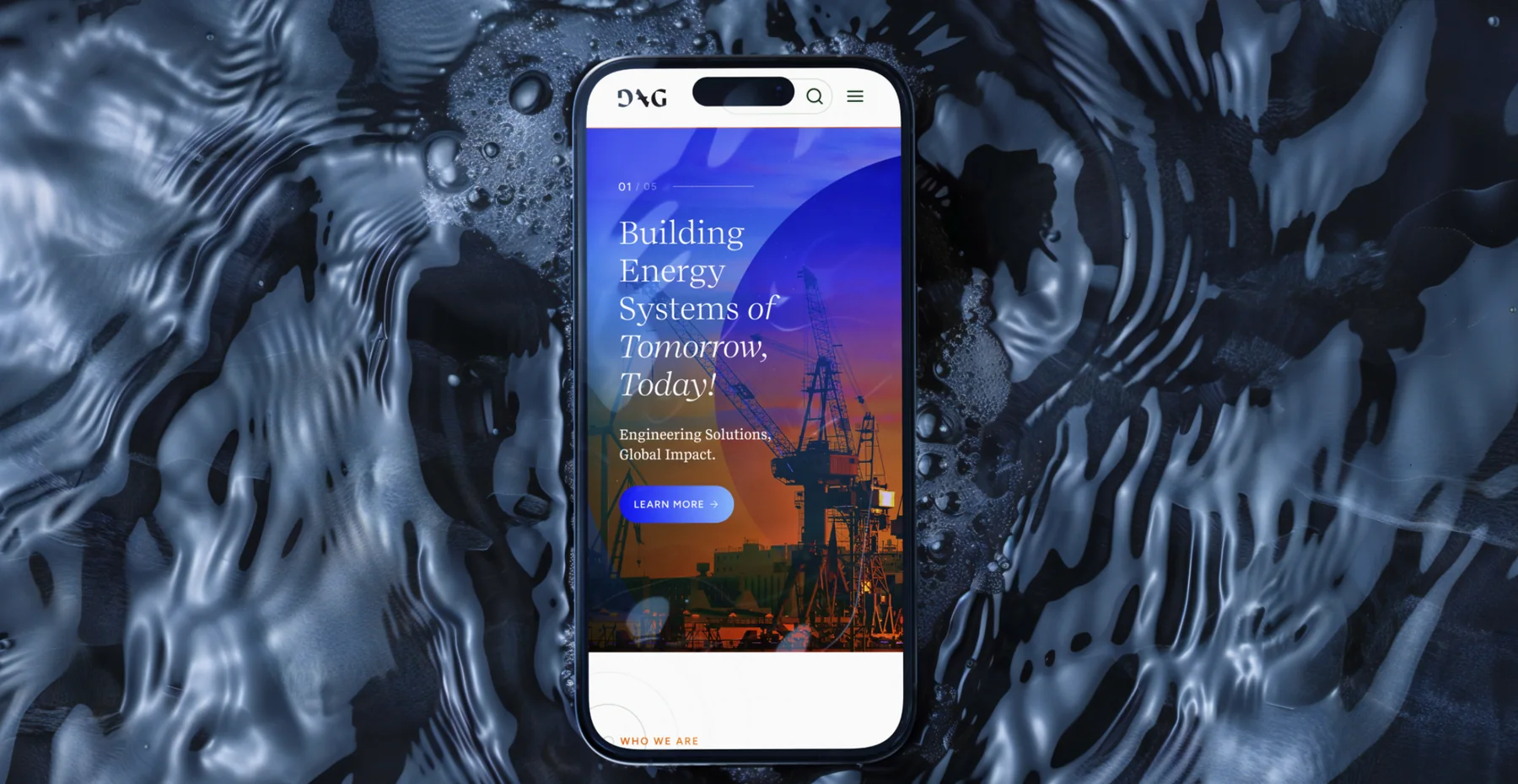
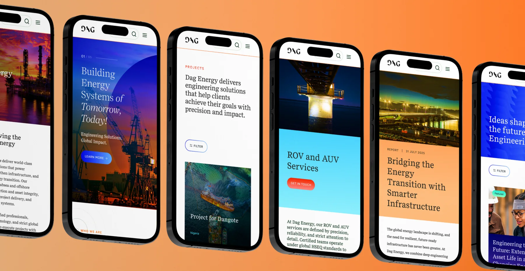
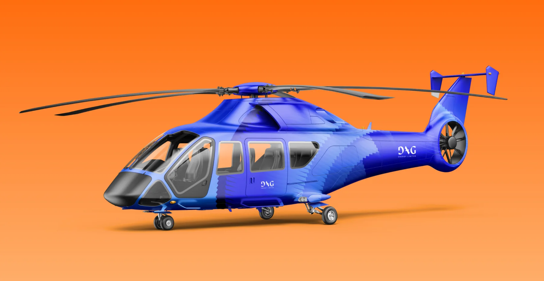
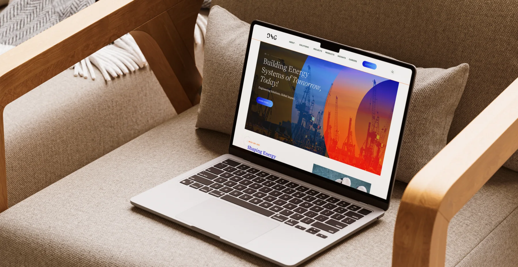
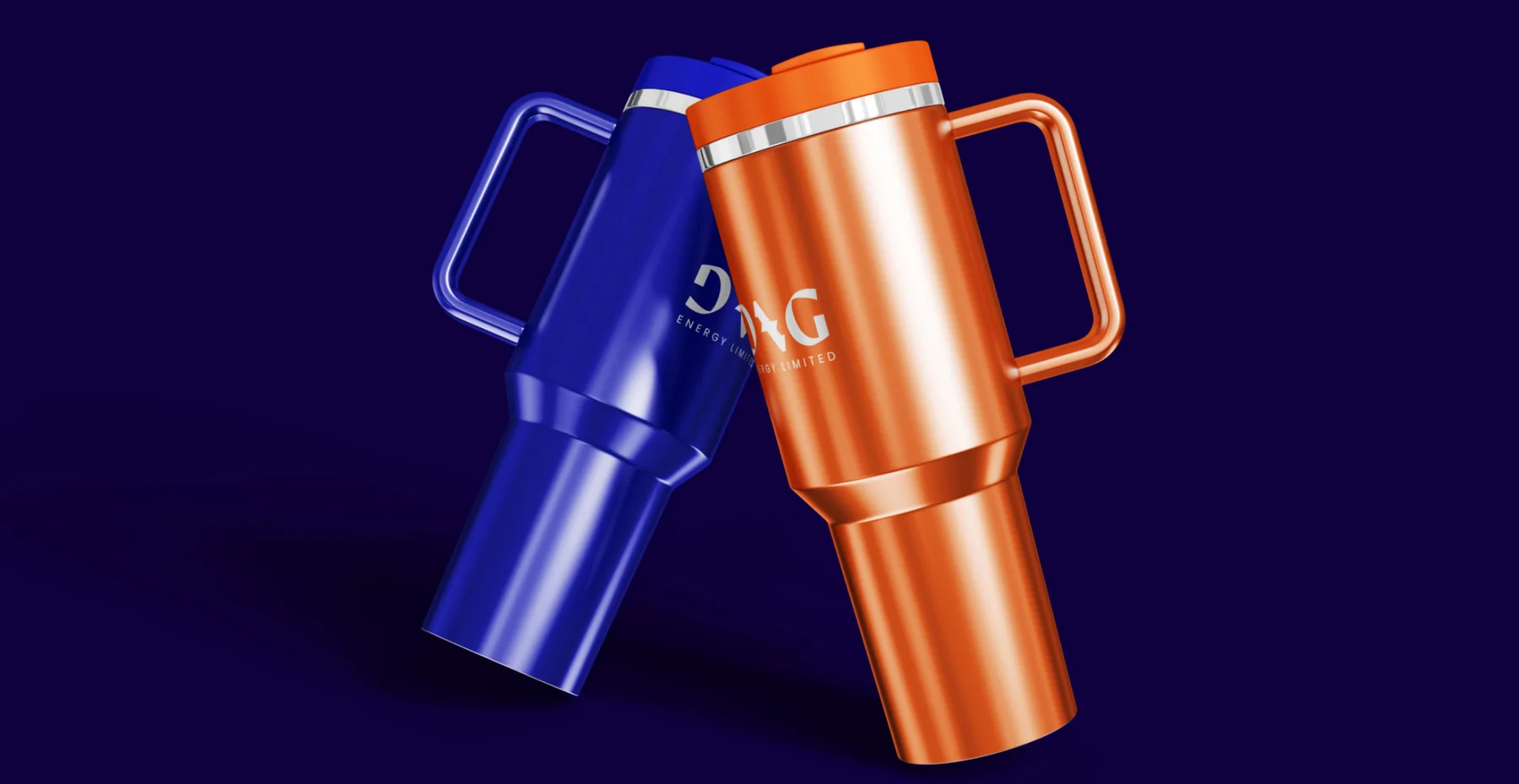
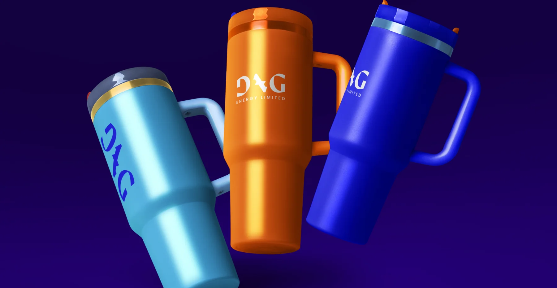
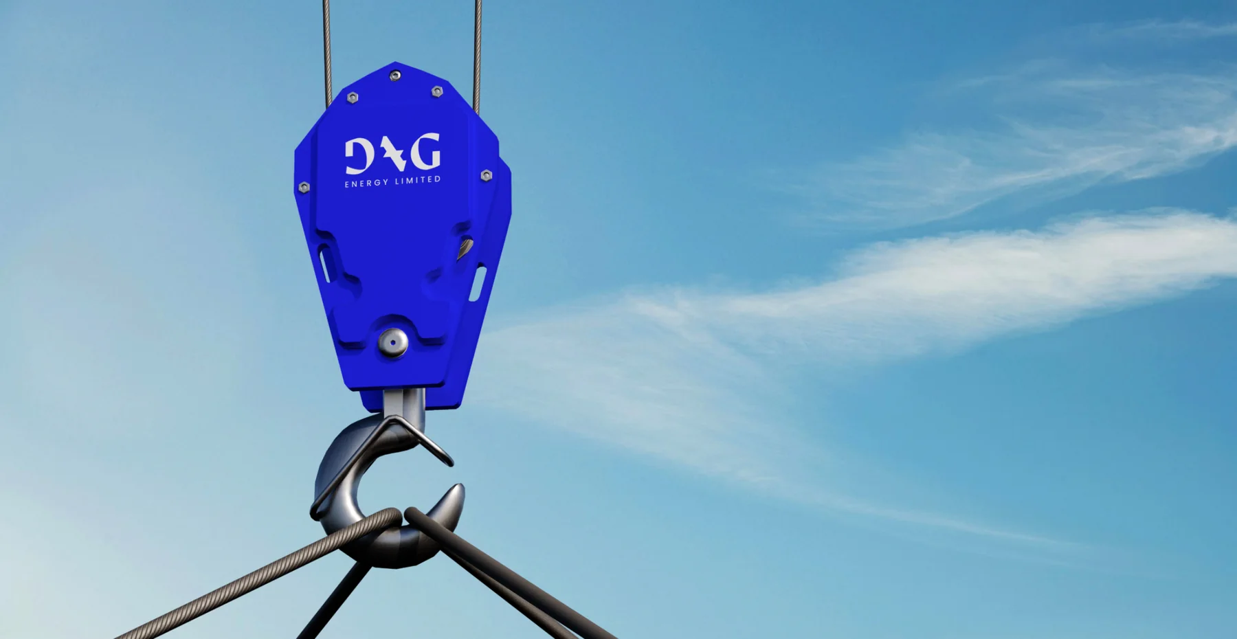
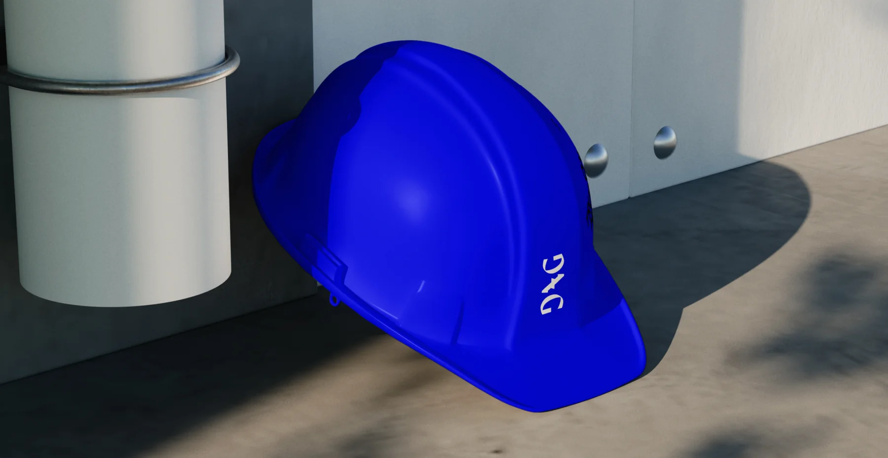
- Applied the identity to workwear, hard hats, stationery, signage, exhibition booths, merchandise and website screens.
Delivered
- Brand platform
- Logo and glyph
- Colour and gradients
- Key graphic
- 3D motion
- Stationery, workwear and signage
- Exhibition booths

Thanks for looking. Want one like this?